Celebrating a community-centered health company
Intrepid Ascent
Uncommon Bold
Sarah’s role:
+ Brand design
+ Brand strategy
+ Workshop facilitation
+ Stakeholder research
+ Visual design
+ Logo design
+ UI/UX
+ Web design
Intrepid Ascent is a leading health consultancy working at the crossroads of policy, technology, and change management. Sarah brought Intrepid from discovery to rebrand and website launch, maintaining the strong people-first focus of the company.
Elaine Chen, Illustration
Amber Cooley, Project management
Aine Cryts, Copywriting
Marc Curry, WordPress development
Ashley Greer, Qualitative research
Joanne Lam, Art direction
Emily F. Peters, Brand strategy
Elaine Chen, Illustration
Amber Cooley, Project management
Aine Cryts, Copywriting
Marc Curry, WordPress development
Ashley Greer, Qualitative research
Joanne Lam, Art direction
Emily F. Peters, Brand strategy
1. Determining the brand strategy
Uncommon Bold led a workshop focused on visual choices in order to move Intrepid’s self-reflection outside of the brain and into the gut, We asked them to note which images felt like Intrepid and which didn’t at all. Emily F. Peters guided the conversation in-person as Sarah led the team virtually on Zoom Whiteboard. With Sarah’s guidance, Uncommon Bold now has a blueprint for seamless hybrid workshops.
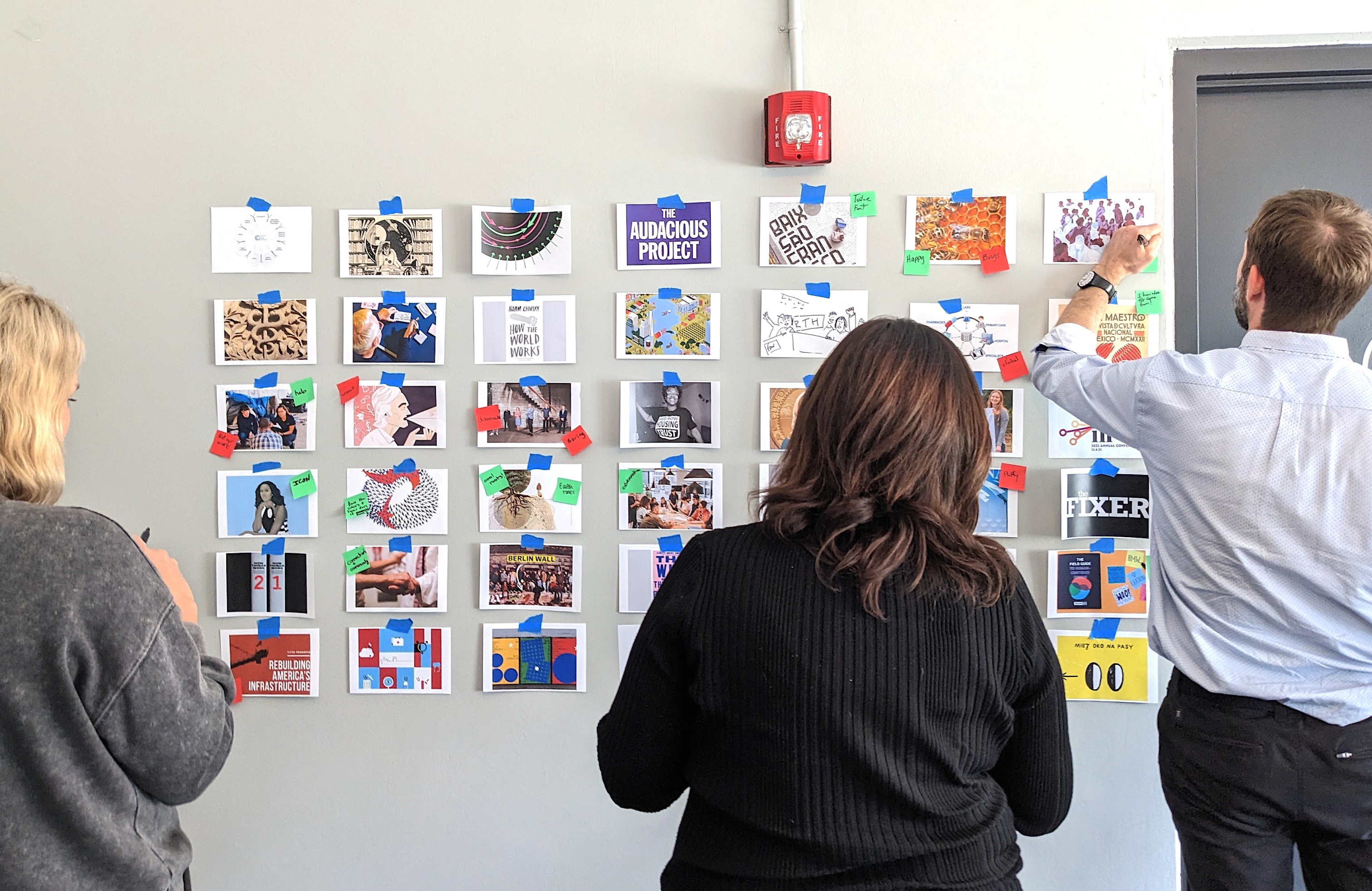

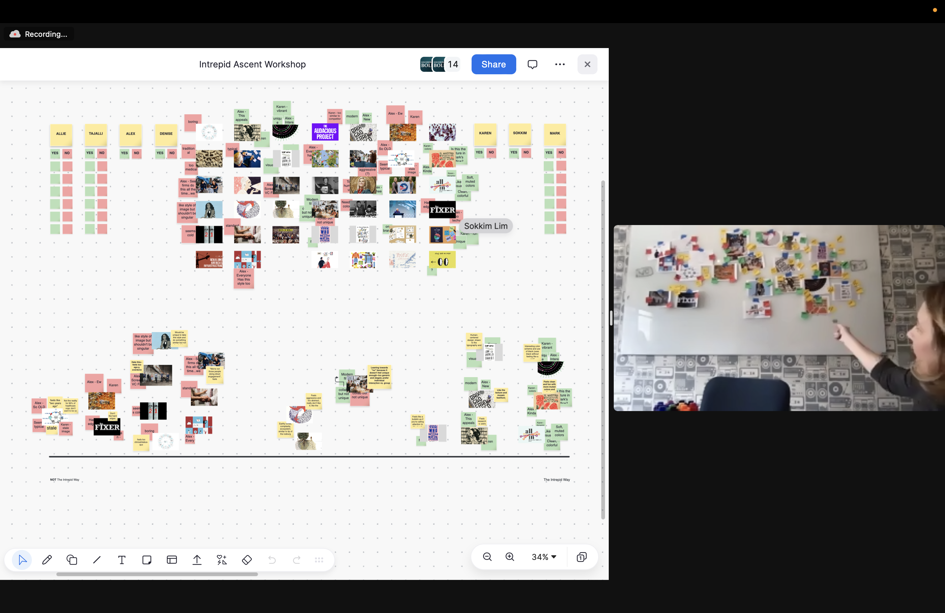

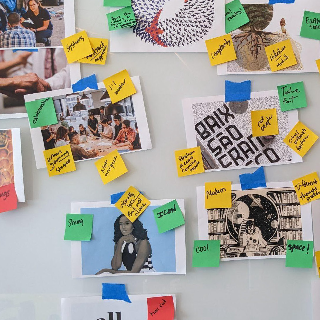
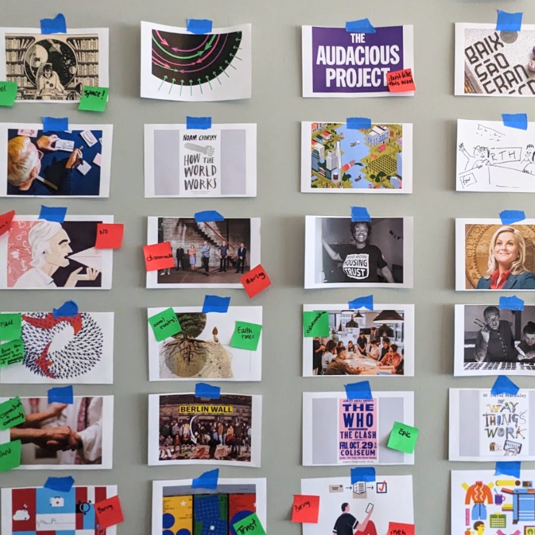
Photos by Emily F. Peters
2. Deciding on a design direction
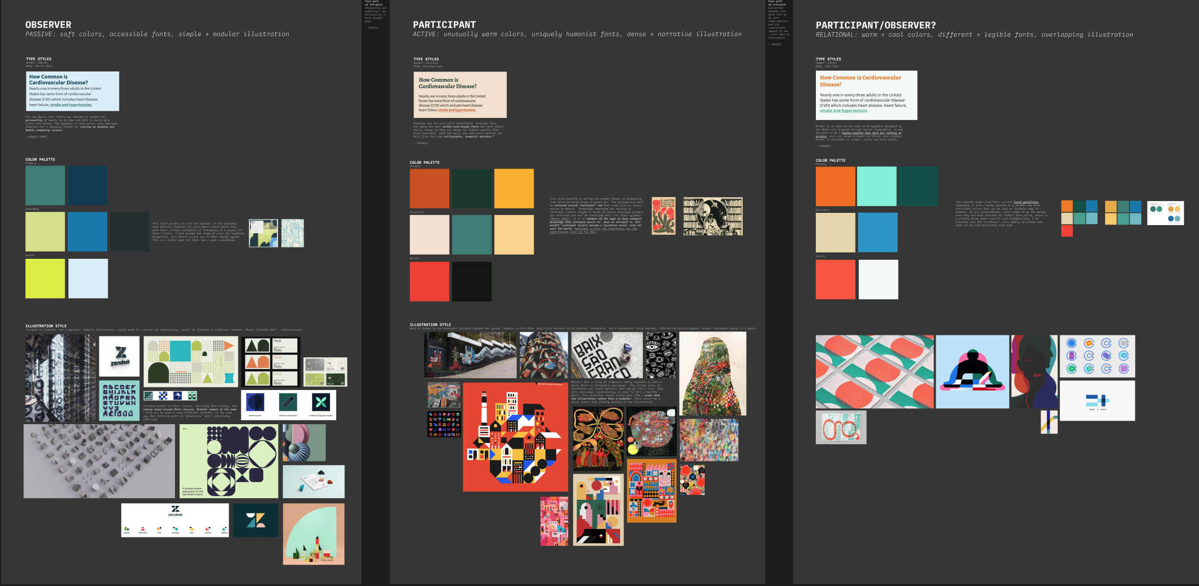
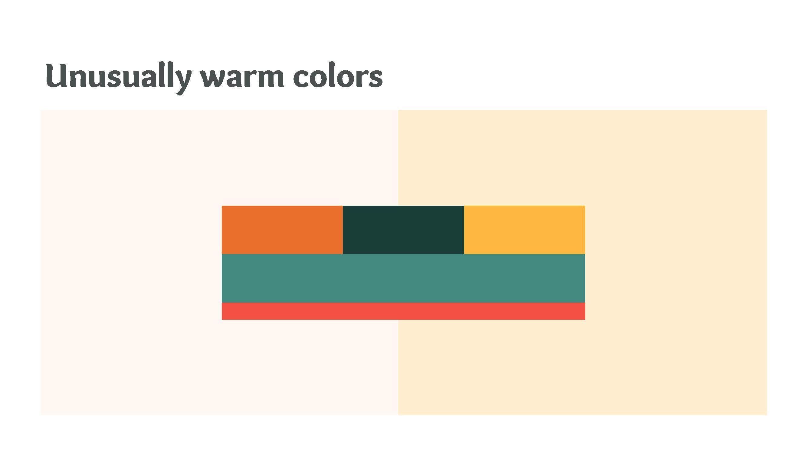
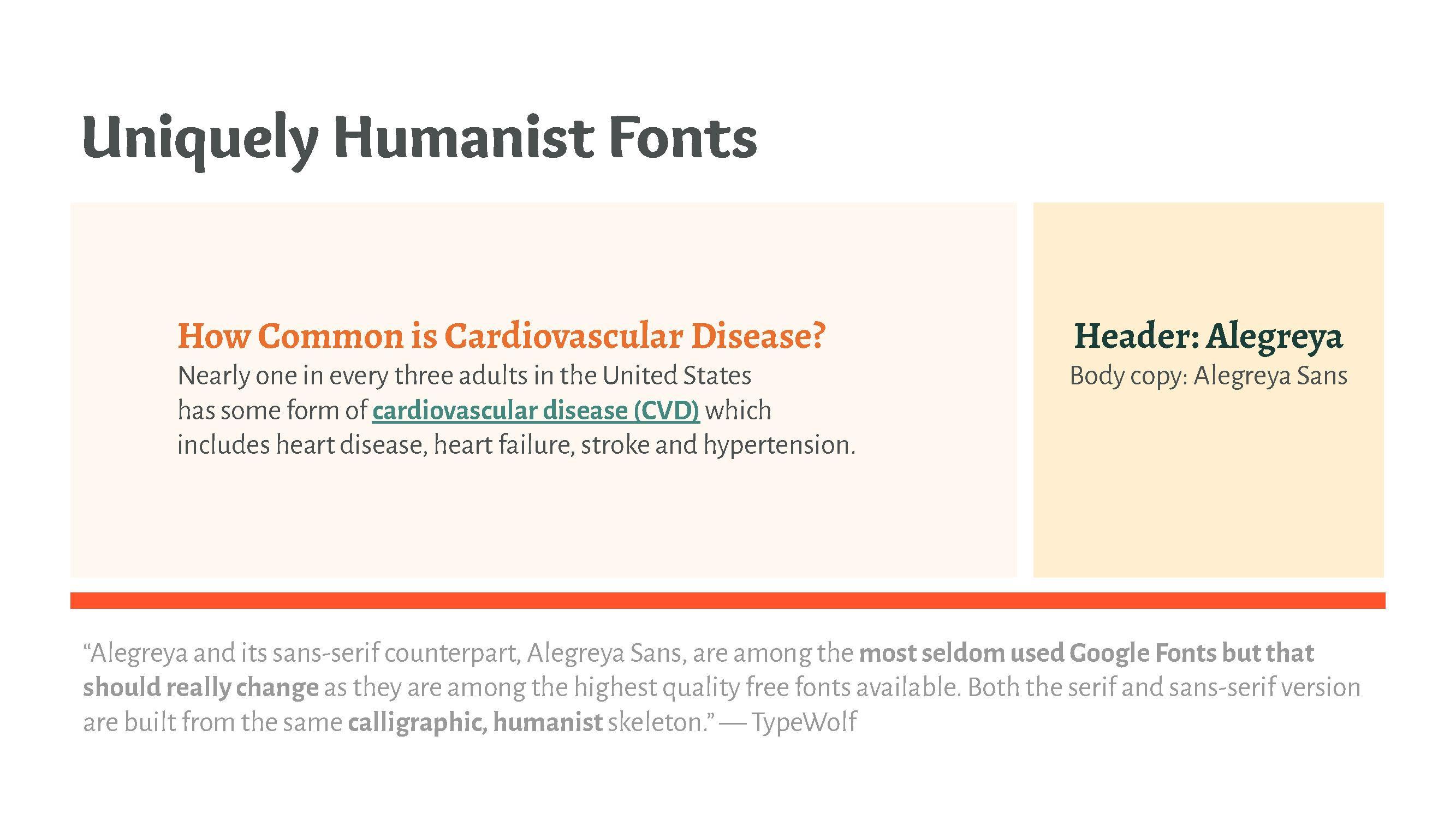
Intrepid had two contradictory identities — a more passive brand that molded around their clients’ successes and a more active brand that focused on their unique role in the health ecosystem. Sarah explained these two options to the team as “Participant” or “Observer” and offered a third combination, “Participant-Observer.” Each direction had clear color, typography, and illustration direction. The client was most drawn to the warm and human “Participant” direction.
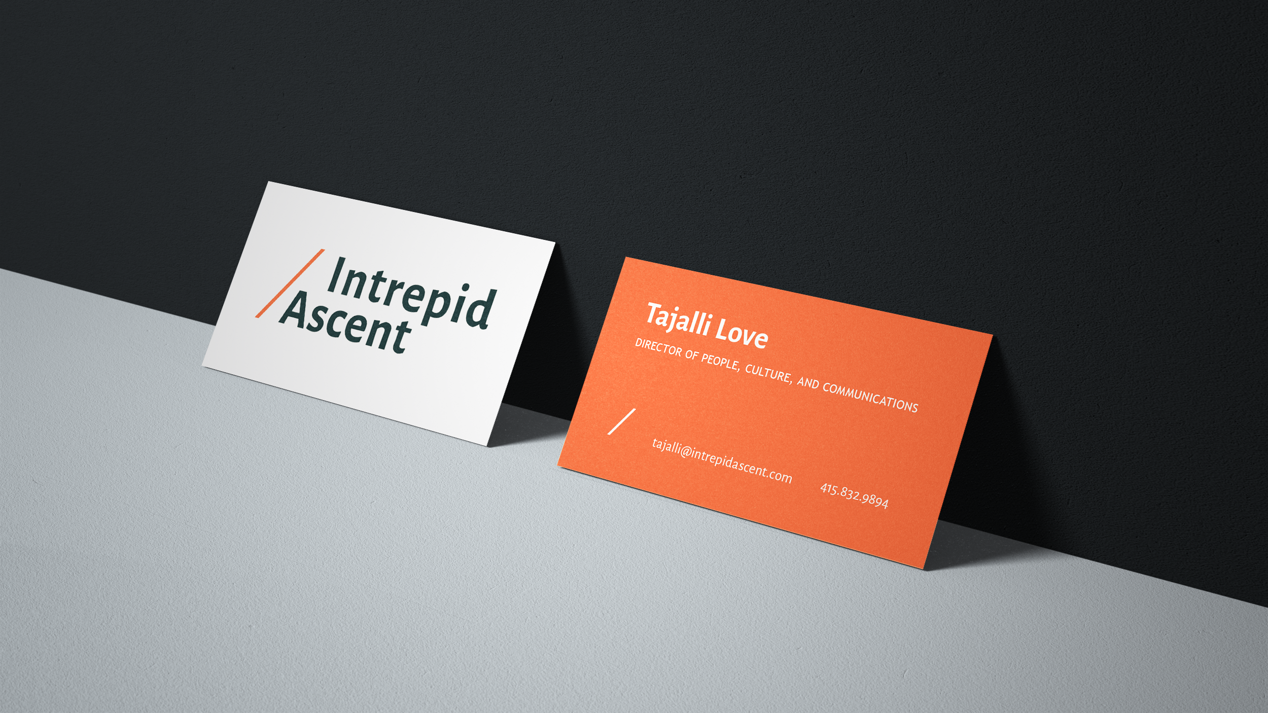
3. Evolving a typemark to express the brand
In creating their typemark, Sarah sought to maintain the positive trajectory symbolized by their previous mountain logo. Intrepid was moving their clientele forward and upward with their work in untangling health bureacracy and strengthening Medi-Cal. They needed a modern typemark to communicate their impressive work as a health IT consulting company.


4. Presenting Intrepid’s new brand on the web
Working closely on Figma with the developer and art director, Sarah launched a website that shows off beautiful illustrations created by Elaine Chen and Joanne Lam. They tell the story of the connective process of co-creation. As a web designer, Sarah’s job was to make the UI a vessel for the illustrations to shine.


 Read about process and see the outcomes on Intrepid’s new website.