Creating a wellness brand
@wellgoodting
Krysten Peck
Wellness practitioner
Sarah’s role:
+ Creative direction
+ Logo design
+ Brand design
+ Graphic design
+ Social media templates
+ Project management
Krysten was ready to step up her social media presence, but needed a design partner. She wanted a brand that paid tribute to her Jamaican roots and that stood out from other wellness accounts on Instagram. Sarah offered her the right ingredients to evolve the brand independently.
1. Learning what the client likes
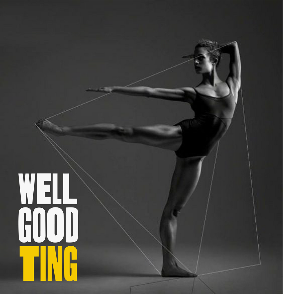
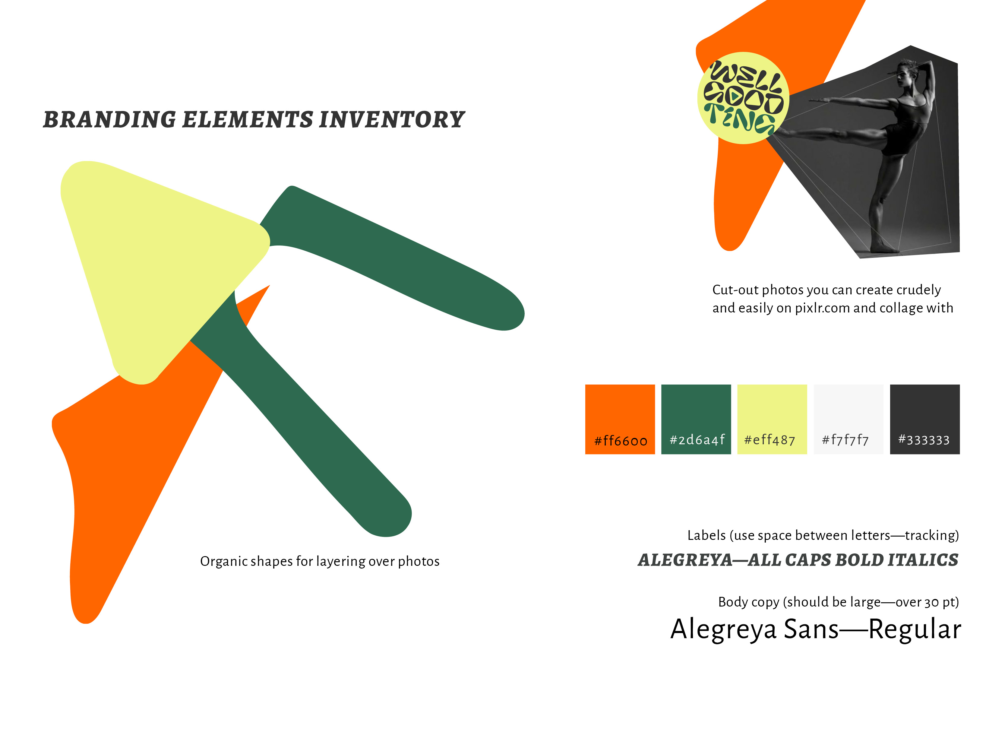
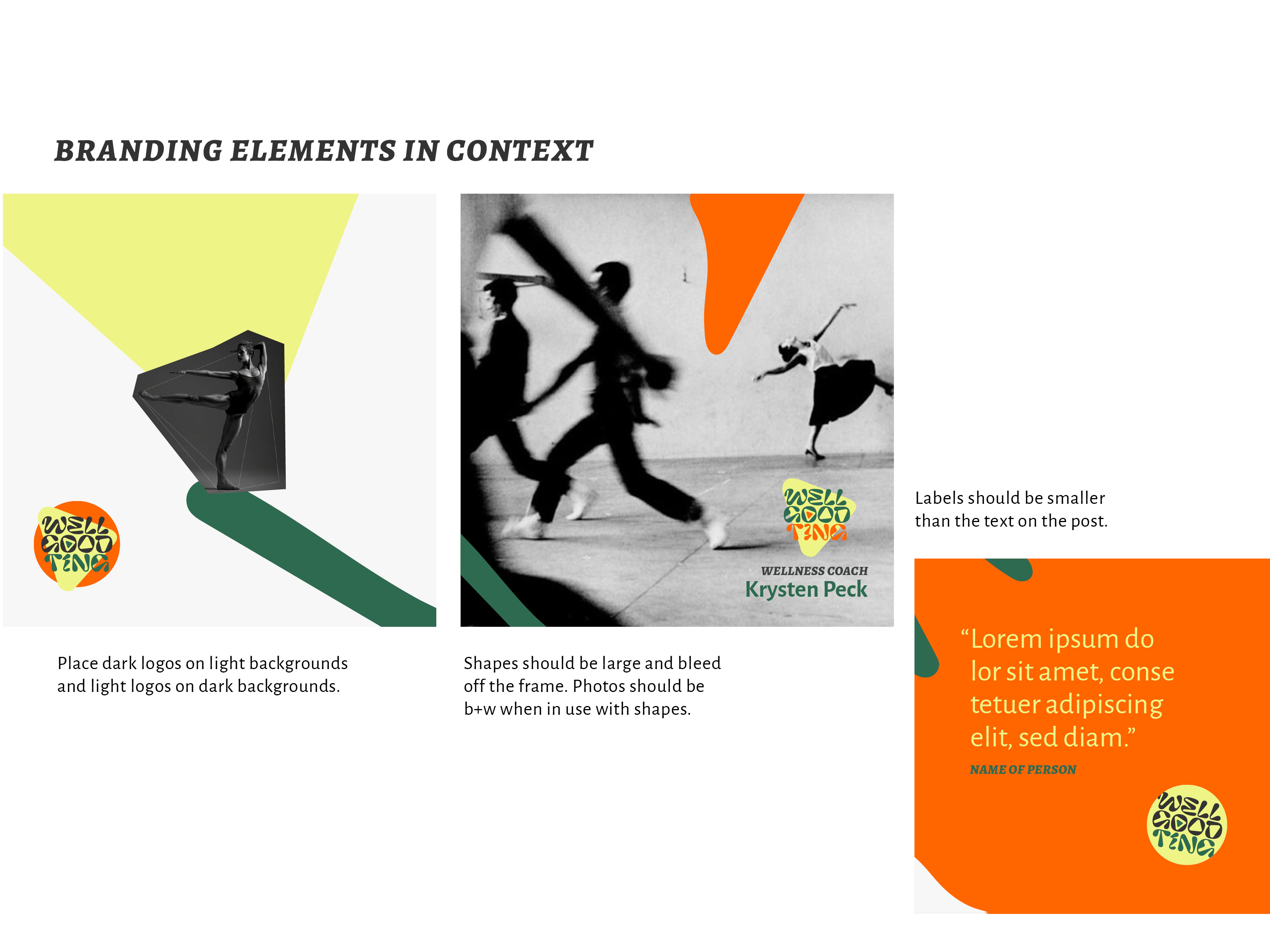
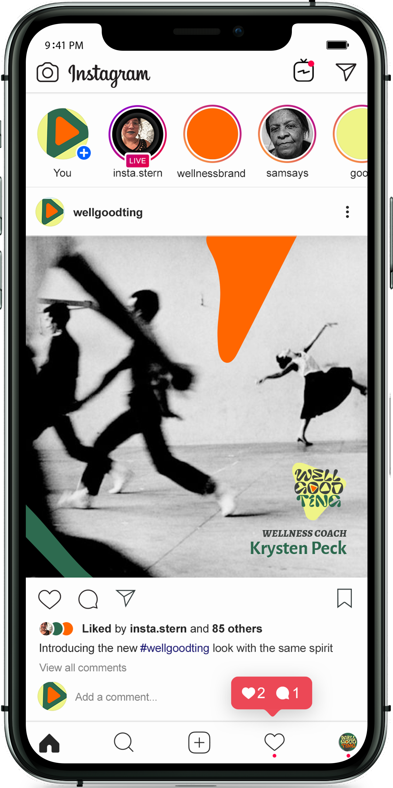
For years, Krysten had been posting wellness tips alongside beautiful black and white photos that were full of movement and joy. These images served as a backdrop for the bold colors and organic shapes that Sarah included in Krysten’s final toolkit.
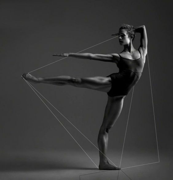
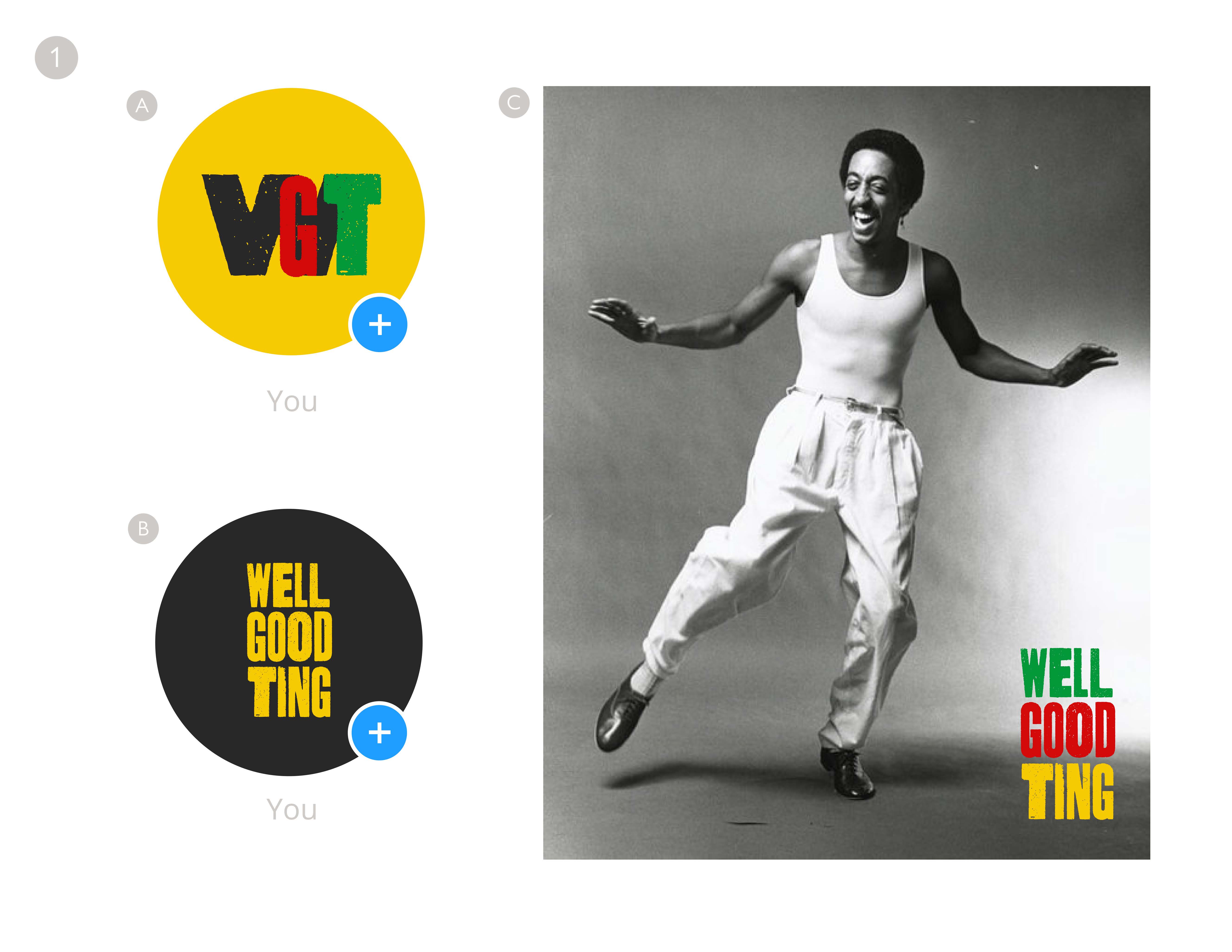
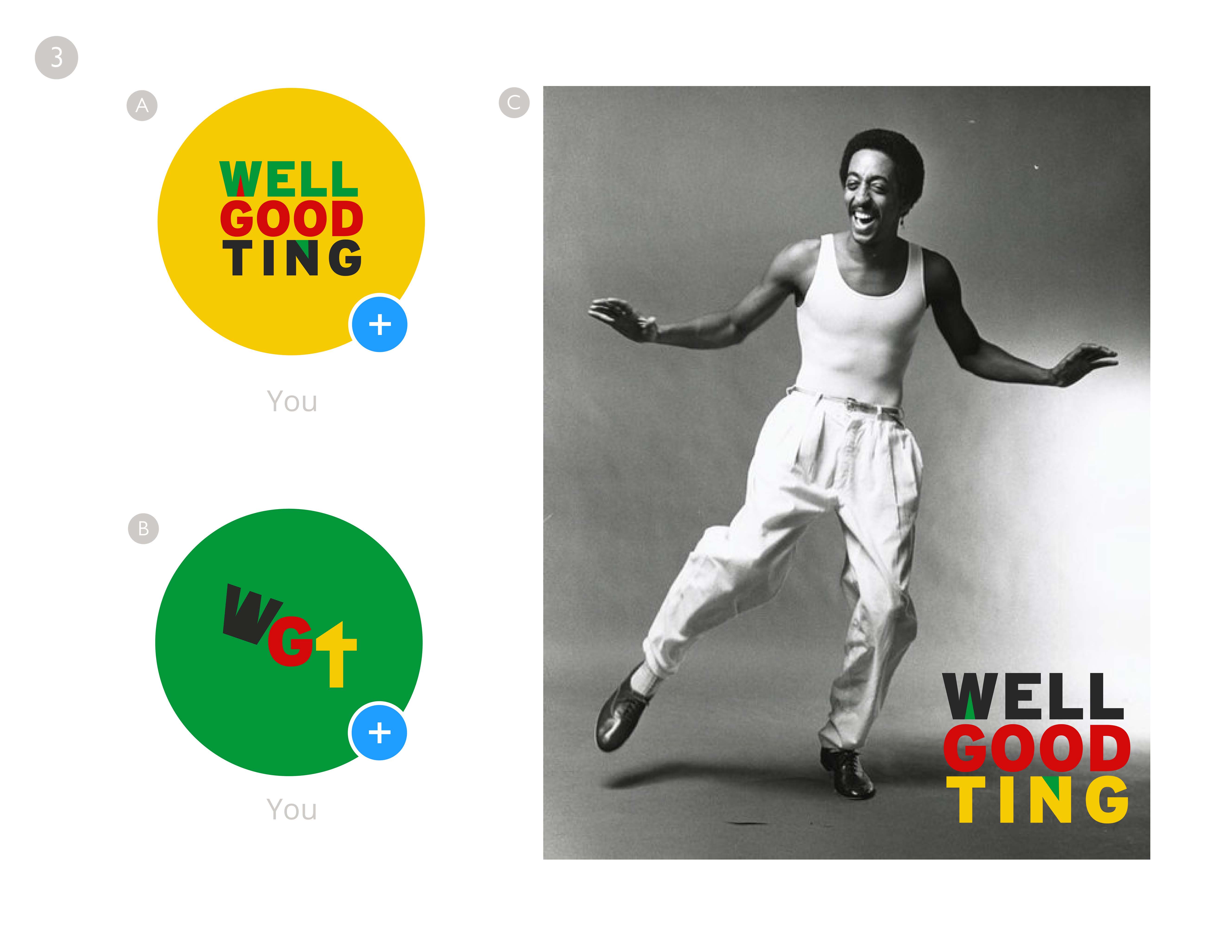
 Photo sourced from @wellgoodting
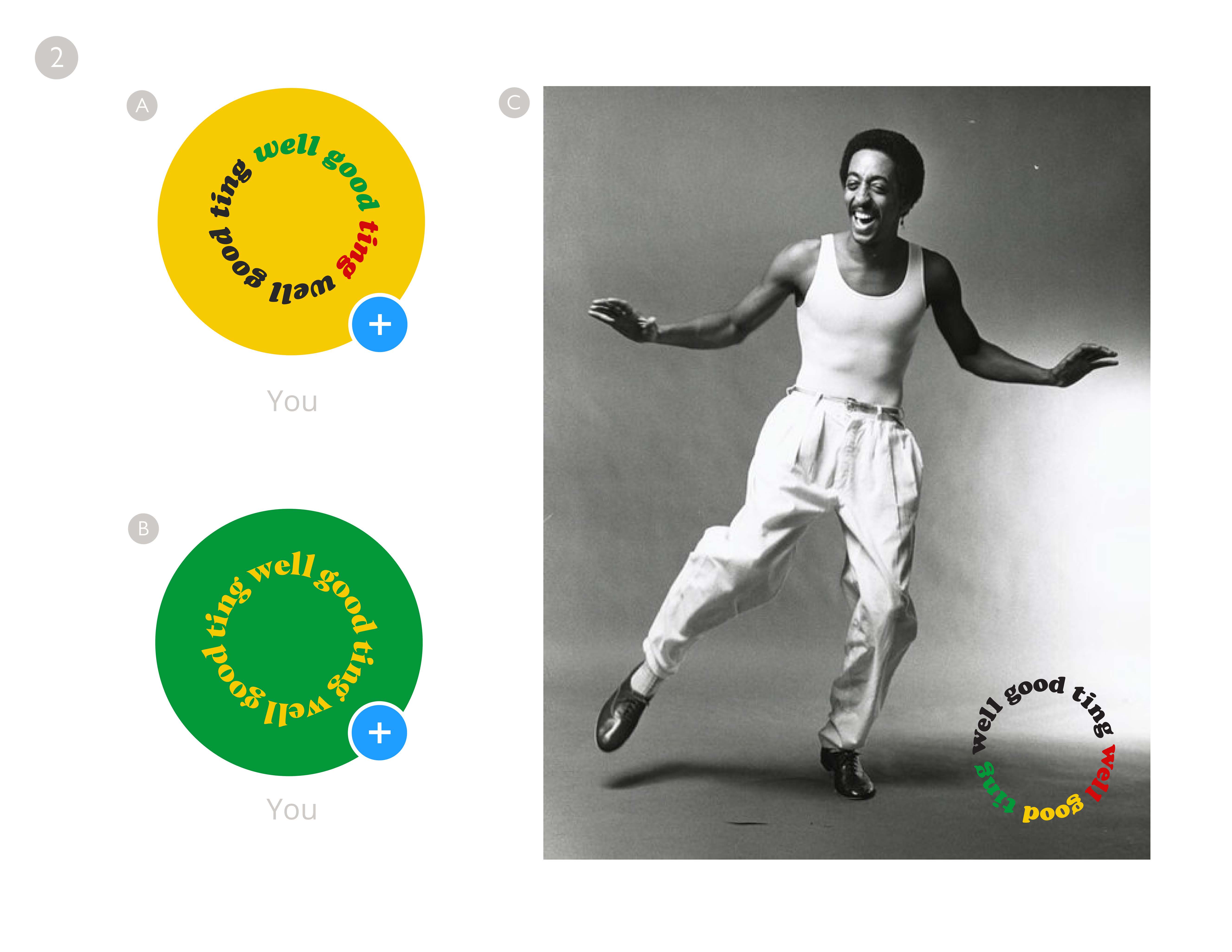
2. Offering multiple directions
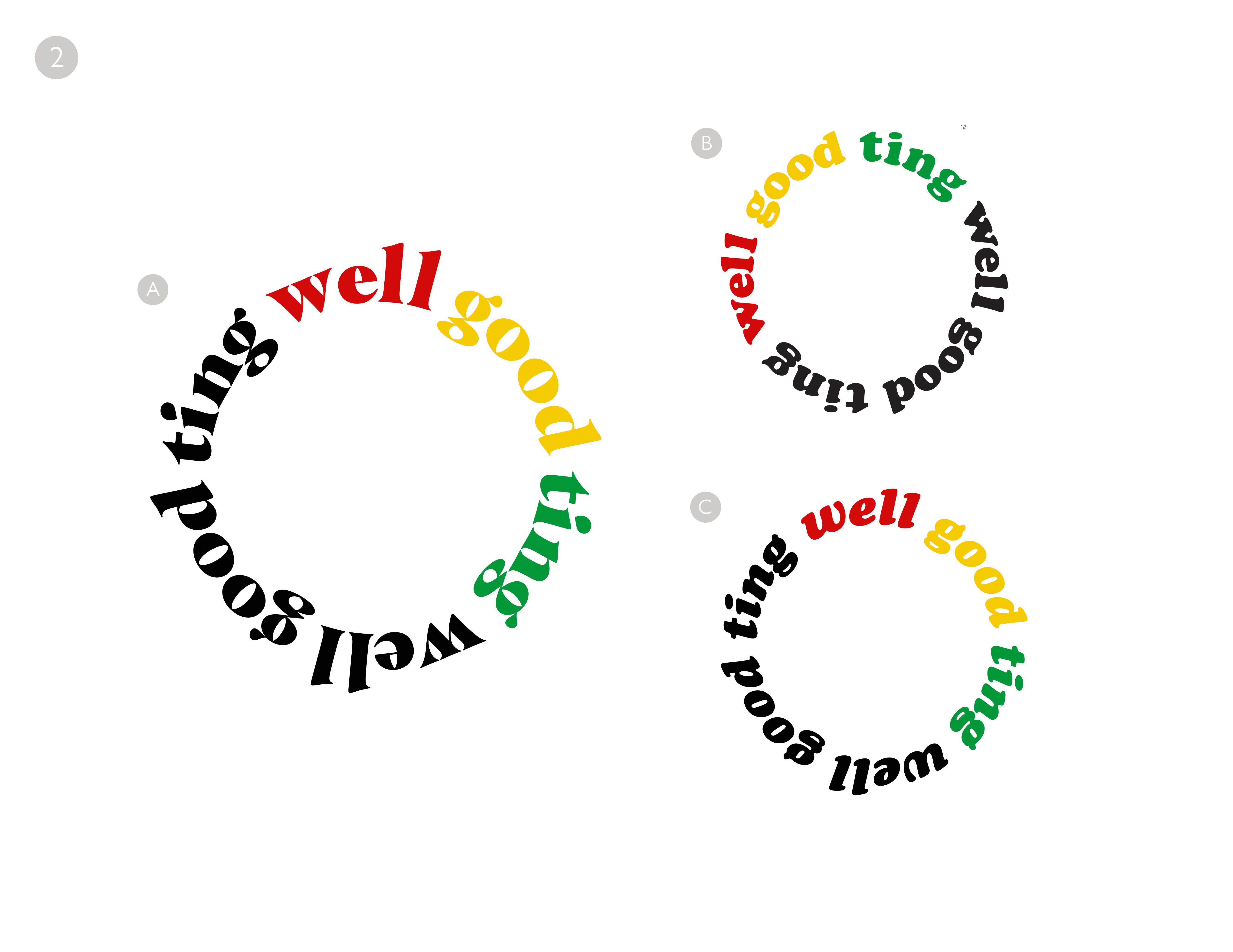
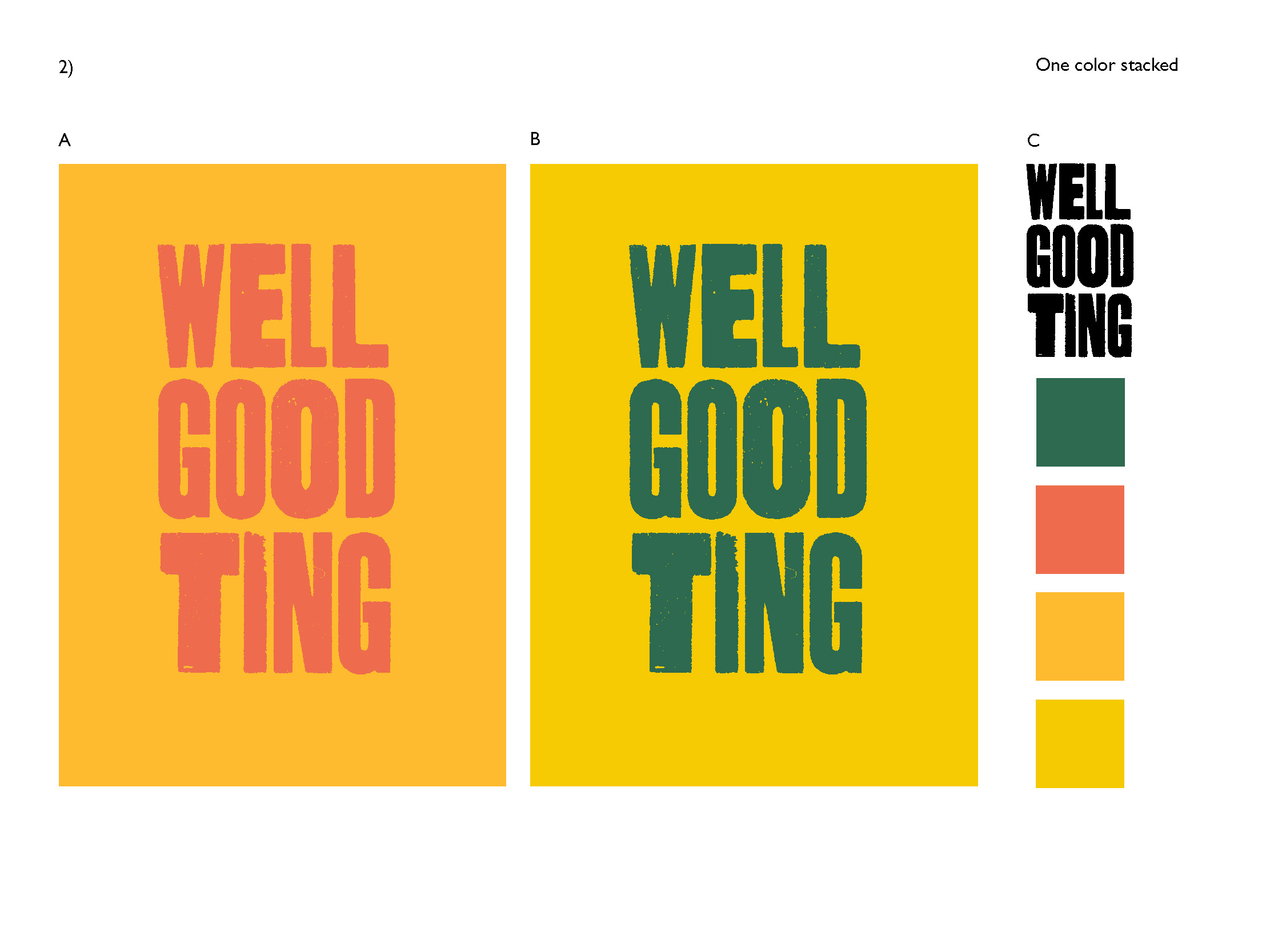
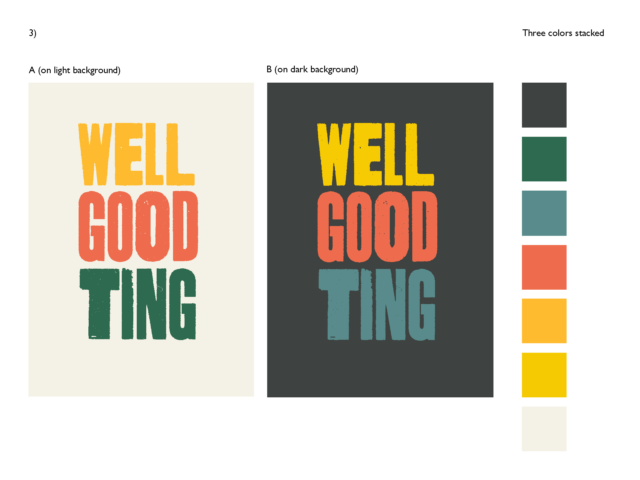
Sarah and Krysten started with three different logo directions.
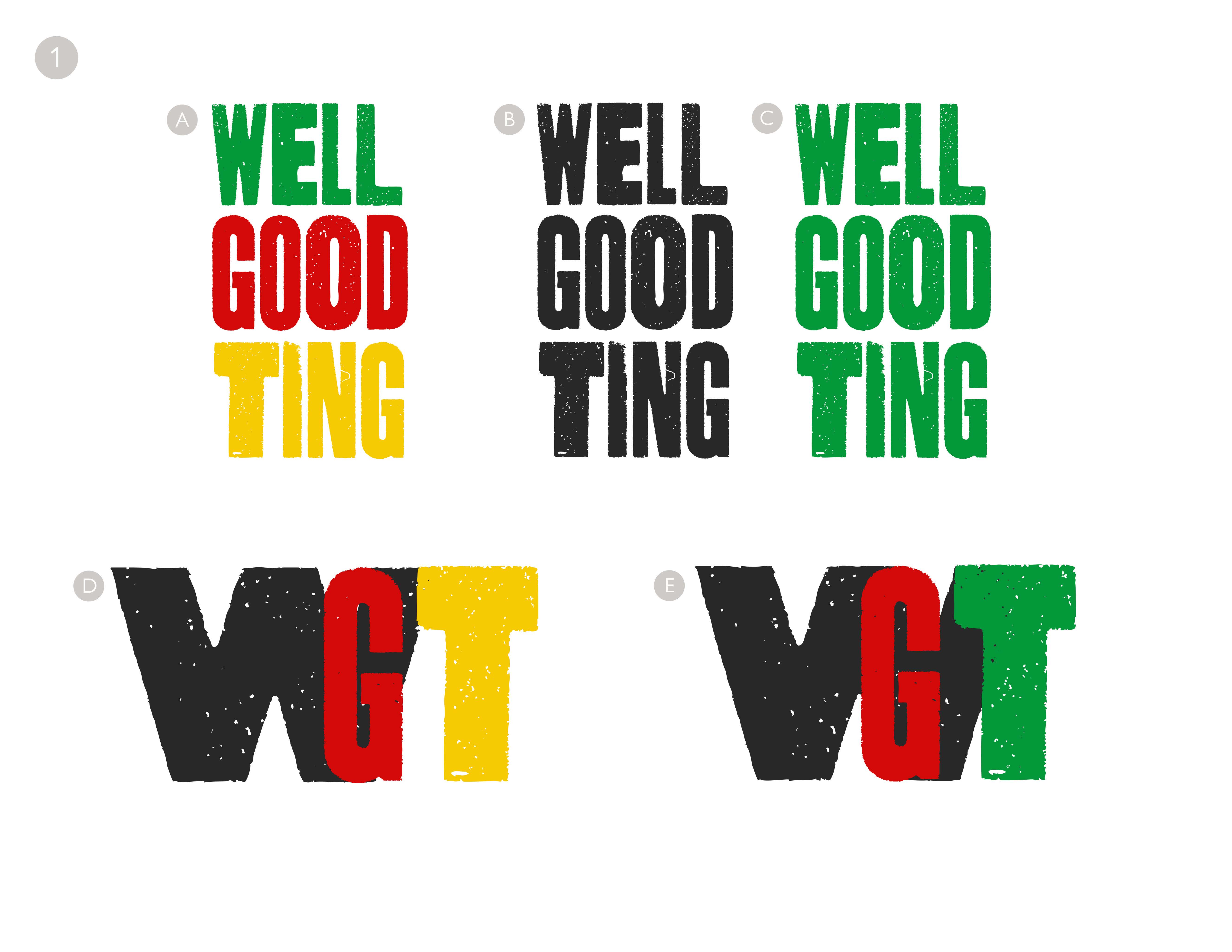
3. Refining a chosen direction
In refining color, Krysten shared she liked visually highlighting “ting” because the Jamaican slang was core to her brand identity.

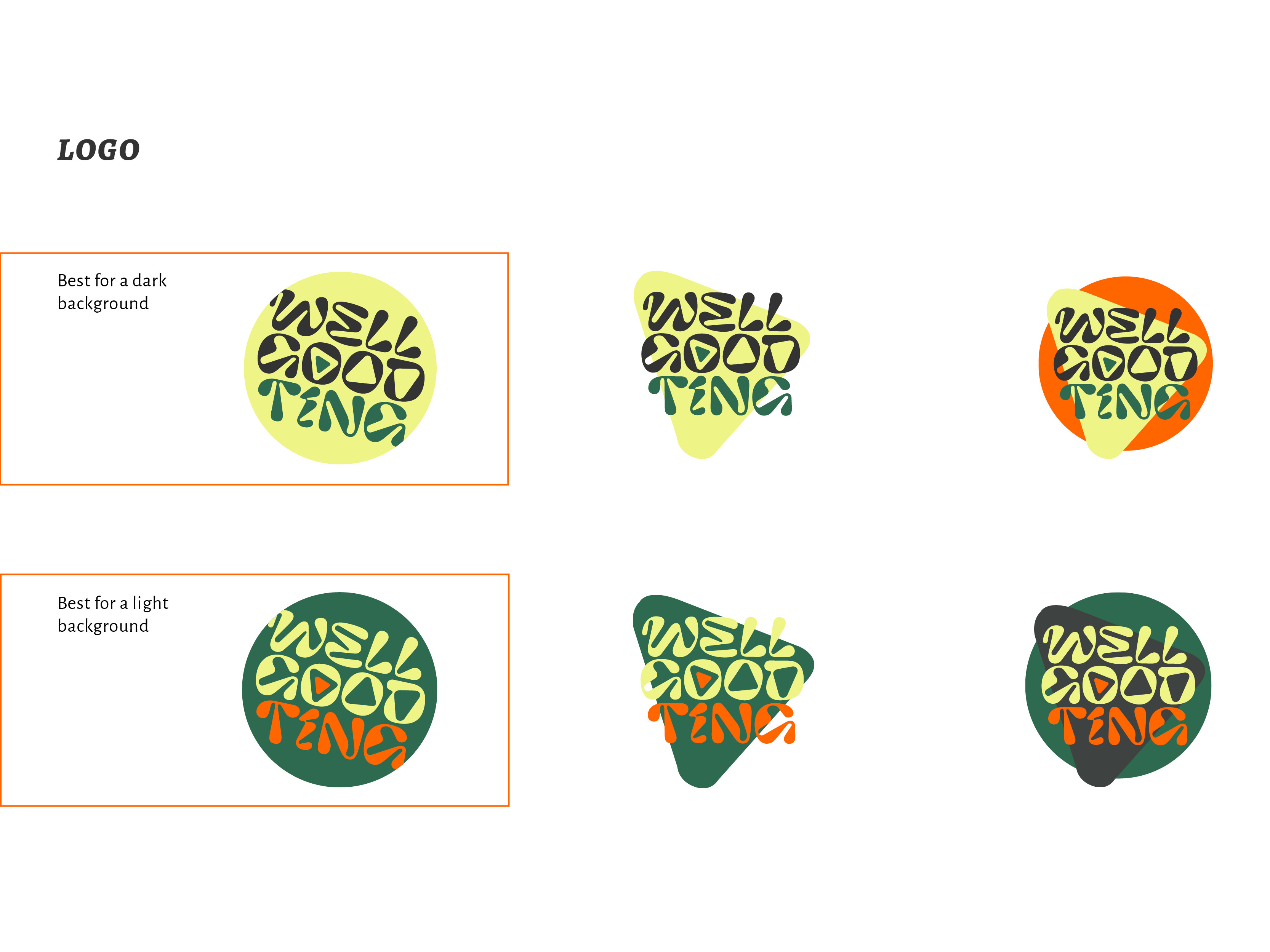
3. Being willing to pivot
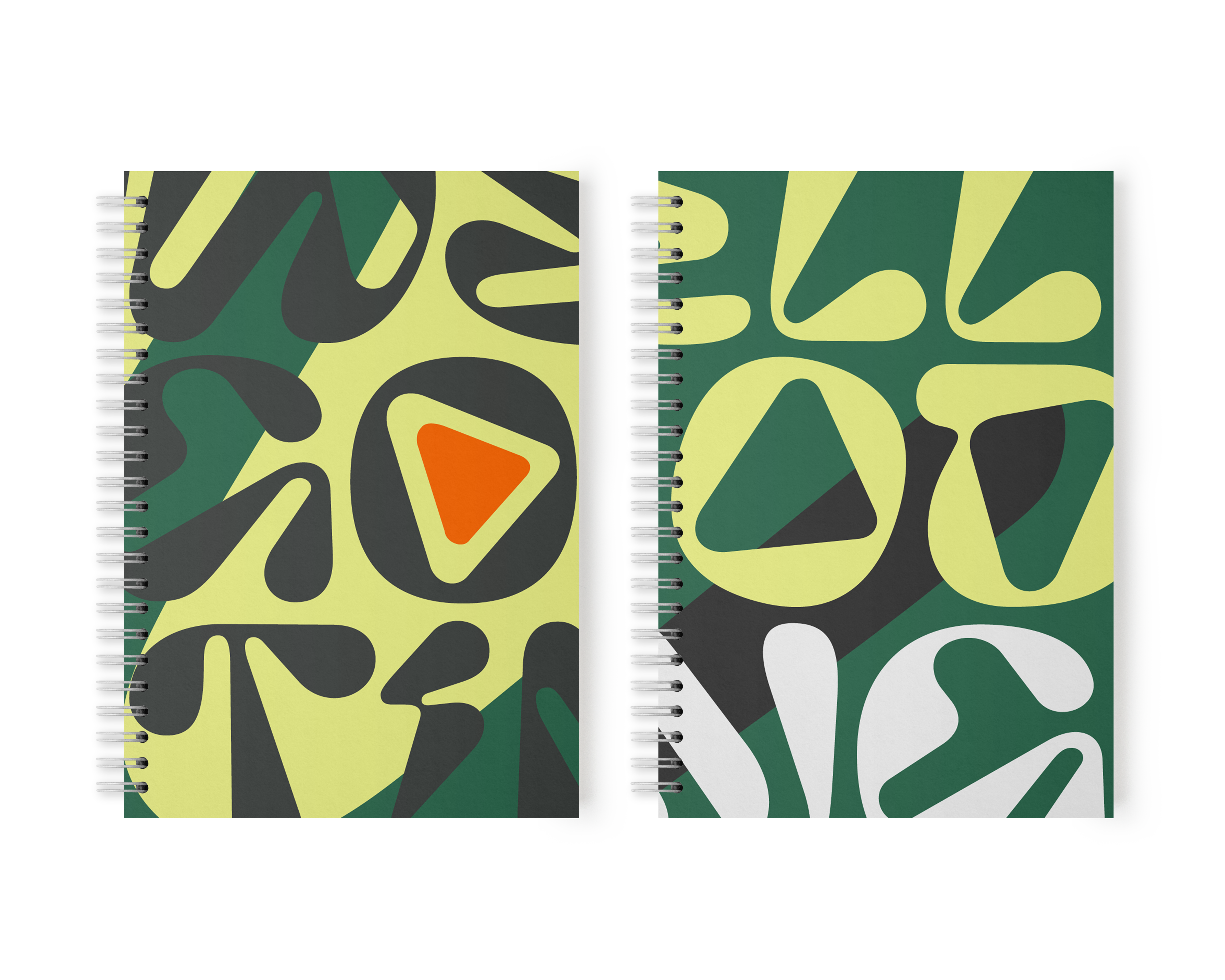
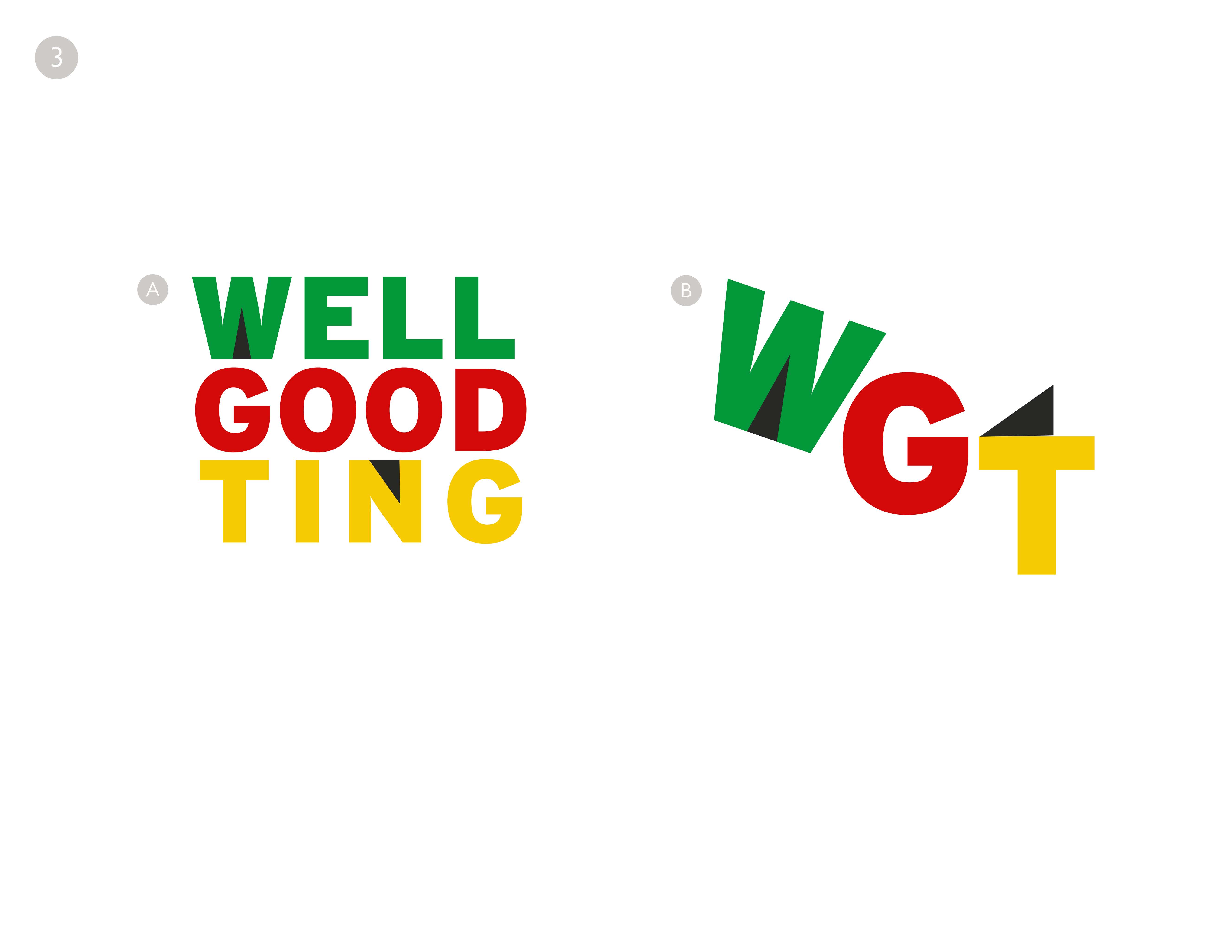
The final identity system in her style guide went beyond the initial three directions and nailed the energy she was after with a vibrant color palette and psychedelic type reminiscent of Jamaican vinyl records.


4. Showing the client what the brand can do
Sarah sent Krysten off with a toolkit, a preloaded Canva account, and some imaginative applications of the brand. The rest is up to her!