Mapping the patient journey
The Pew Charitable Trusts
Communicating Health Data
Health Communication Design MS
Thomas Jefferson University
Sarah’s role:
+ Creative direction
+ Information design
+ Secondary research
+ Affinity mapping
+ Interviews
+ Personas
+ Wireframing
+ Journey mapping
+ Copywriting
+ Graphic design
With the guidance of subject matter experts, Sarah and a group of three UX designers created an empathetic journey map tracking the struggles that come with opioid use disorder (OUD). Pew will use this map to address gaps in the OUD treatment system in Philadelphia.
Design team:
Malachi Atkin, Graphic design
Anushka Khurana, Copywriting
Shriya Patel, Illustration
Design advisors:
Maribeth Kradel-Weitzel
Dhwani Trivedi
Renée Walker
Subject matter expert advisors:
Tracy Esteves Camacho, MPH
Jeff Gillingham, MPH
Dr. Erin Kelly
Matthew Mackley
Dr. Megan Reed
Dr. Lara Carson Weinstein
1. Quickly becoming familiar with the subject area
The first step was to affinity map secondary research. After pulling out main themes, the team constructed the personas which would be the backbone of the project.

2. Determining an information design direction
Subject matter experts advised us that the map should not be linear. After Sarah did some sketching and brainstorming, a metro map structure proved to be the best design direction for this complex topic. Each of the personas followed a different “train line” color on this wireframe of the journey.
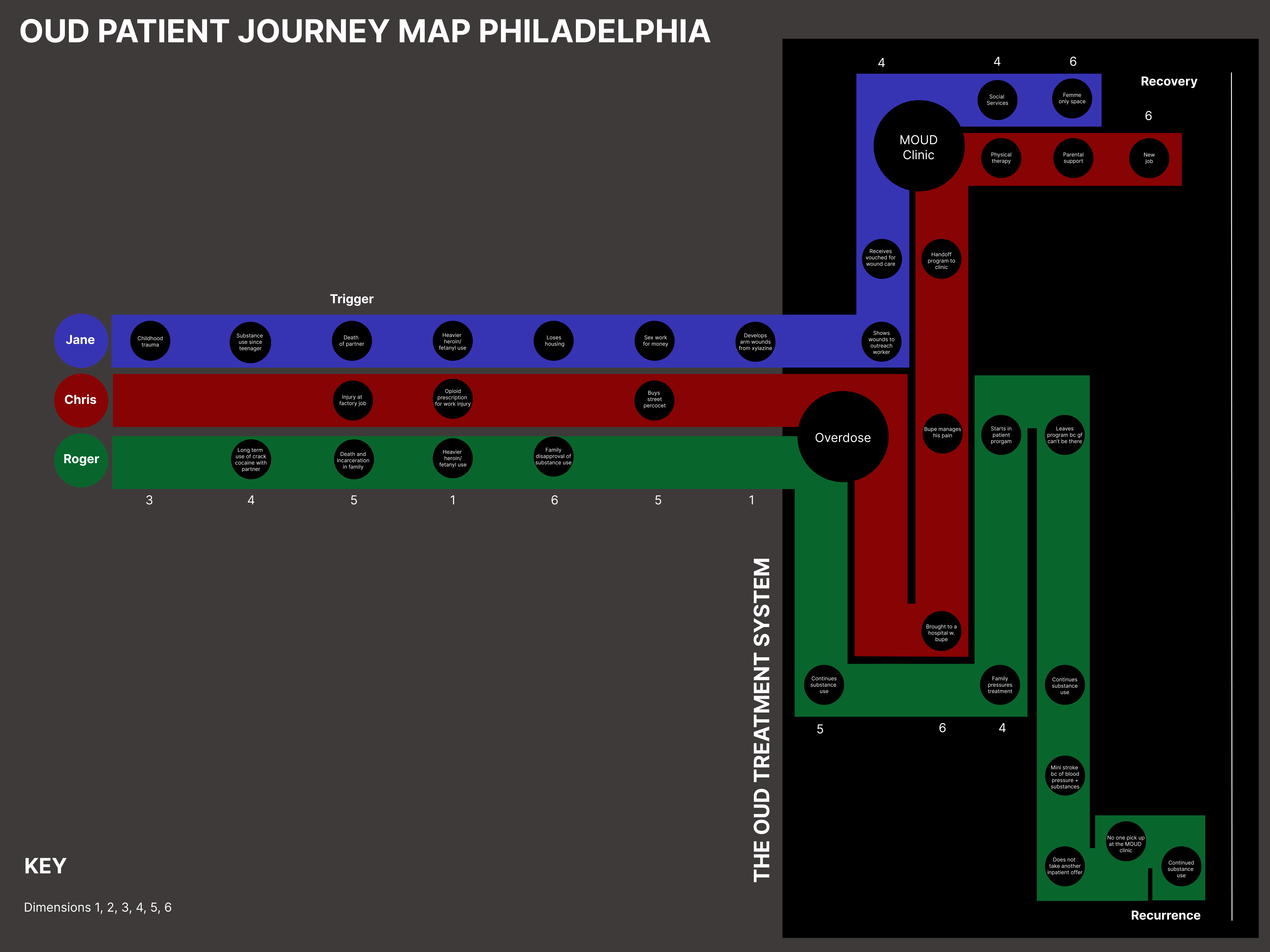
3. Keeping the information structure intact
Getting from wireframe to final product required oversight. Sarah’s role was to make sure illustrations, copy, and graphic design updates kept within the structure of the initial information design wireframe to facilitate easy interpretation.

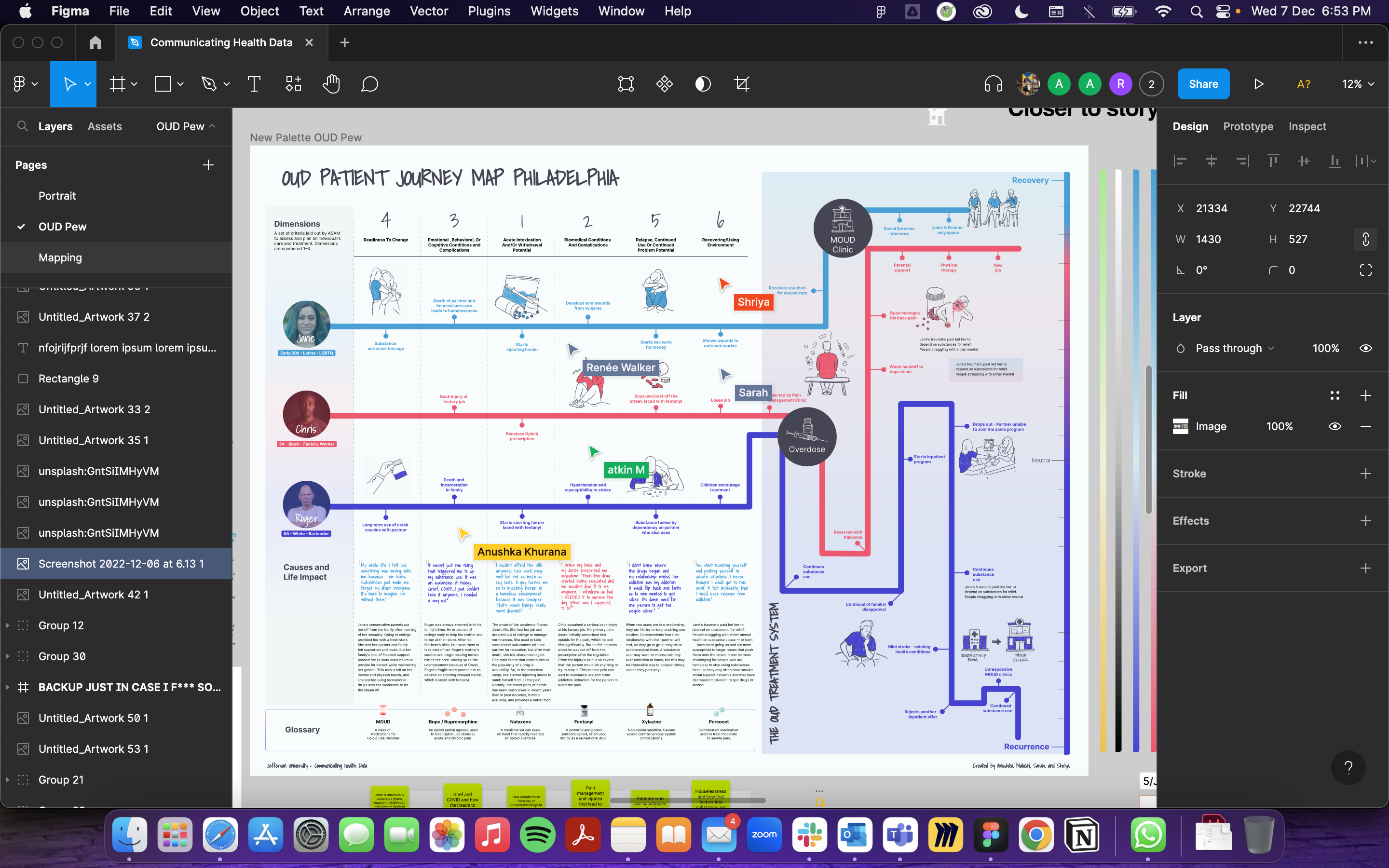
The team completed this project using Figma, Slack, and Zoom.
4. Presenting to the Pew team
The final map offered a combination of hand-drawn illustration and clean lines to balance empathy and readability. The map will be unfolded by the Pew Charitable Trusts representatives, government officials, and other viewers who are eager to understand the journey of people who use substances.