︎ Be original with your typeface
There’s a place for both expressive and legible typography. In designing typefaces, Sarah tends towards the expressive, often looking to print for inspiration.
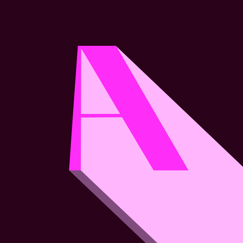
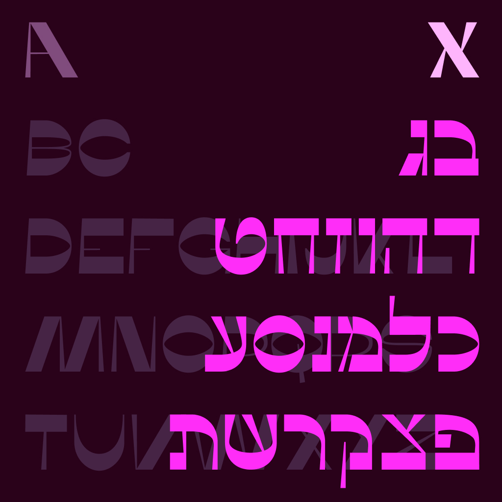
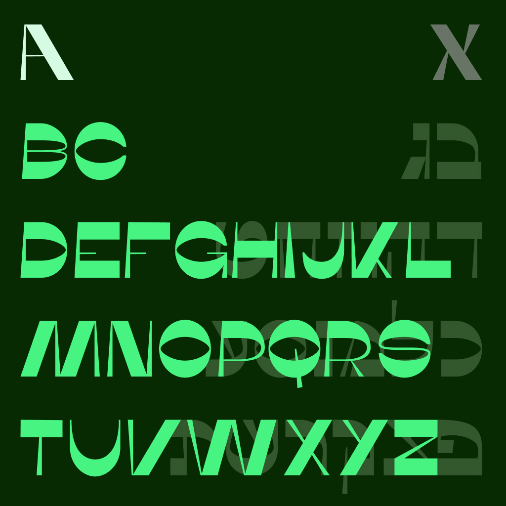
1. Bokeret Display
A self-directed Hebrew/English typeface meant to play on the idea of reverse contrast.

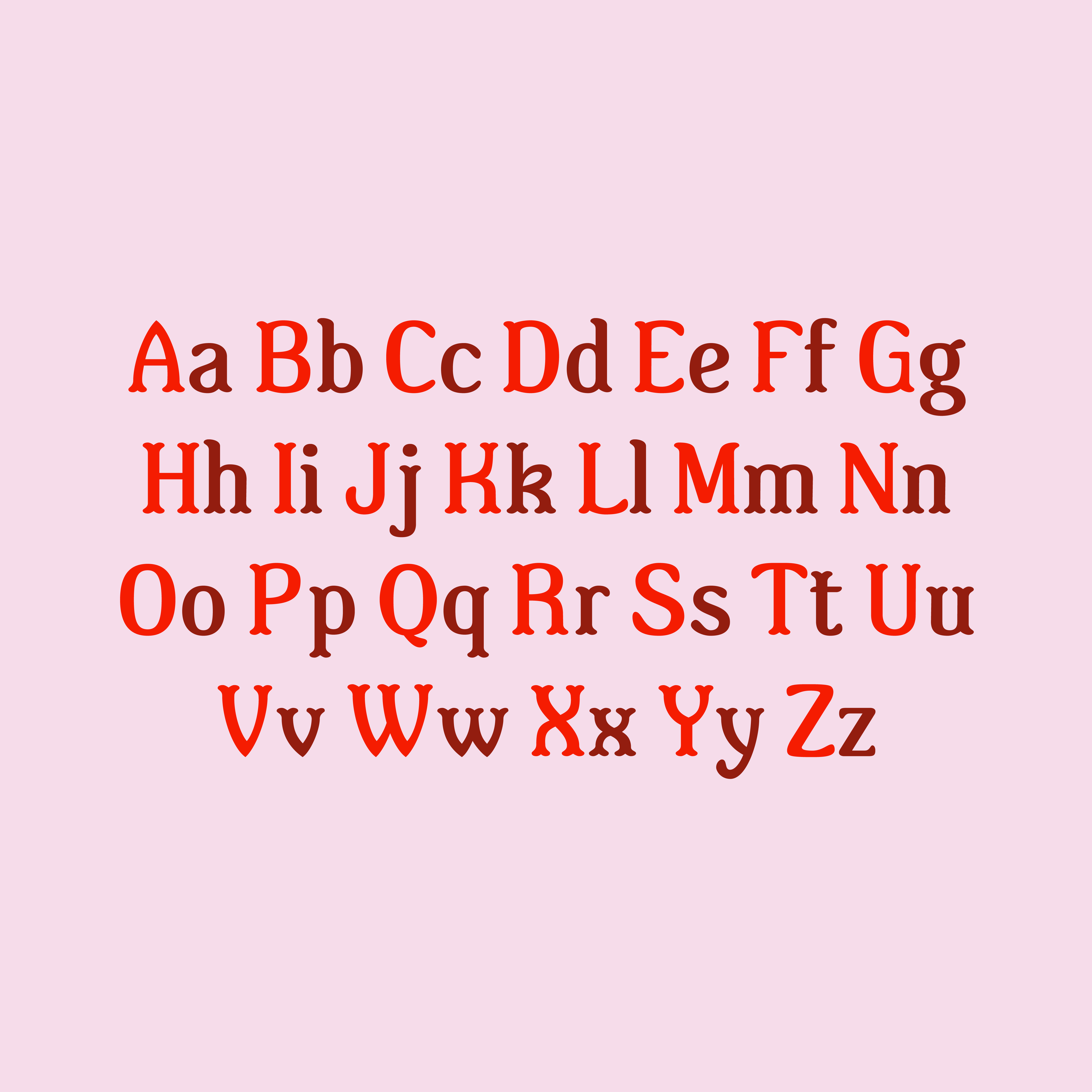
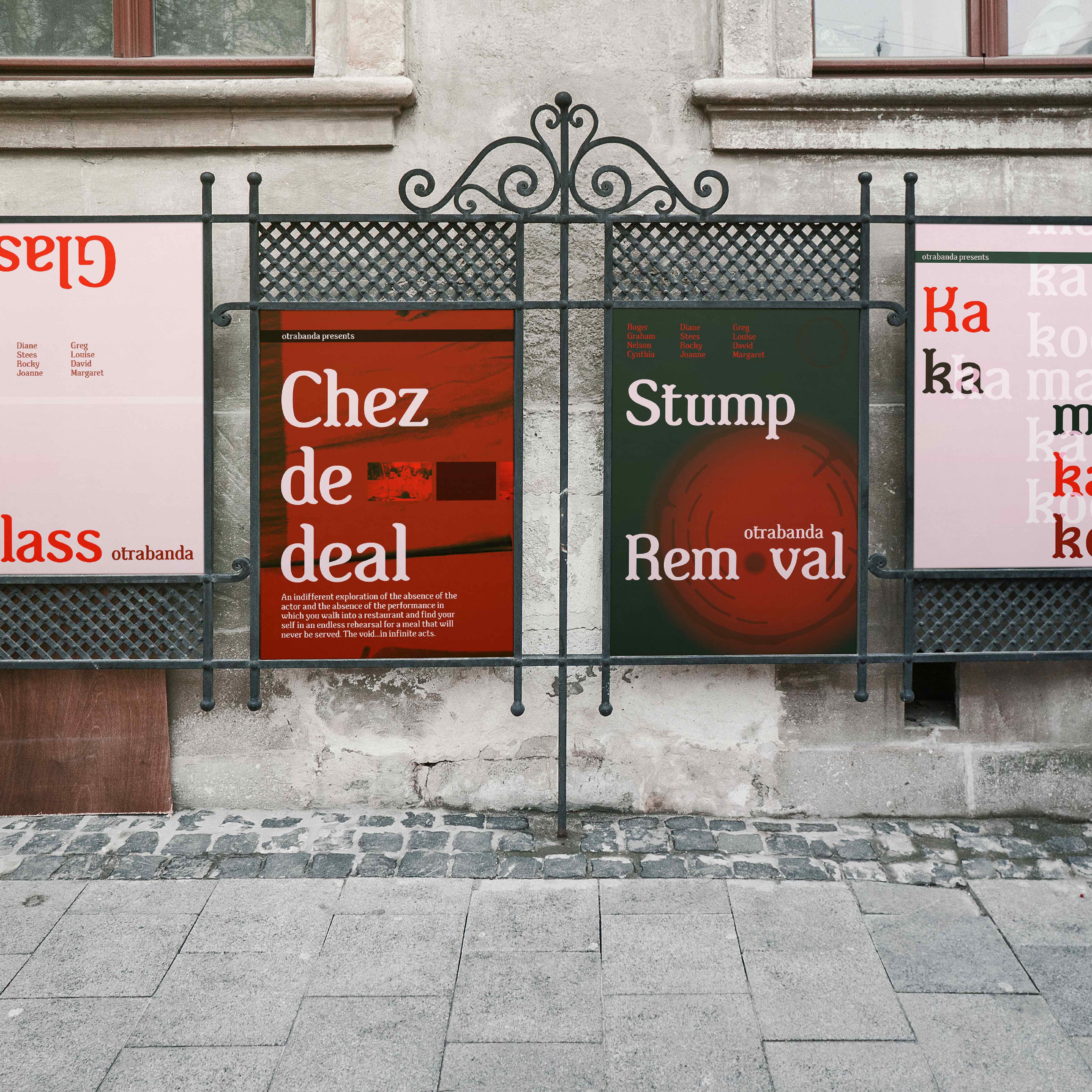
2. Otrabanda Medium
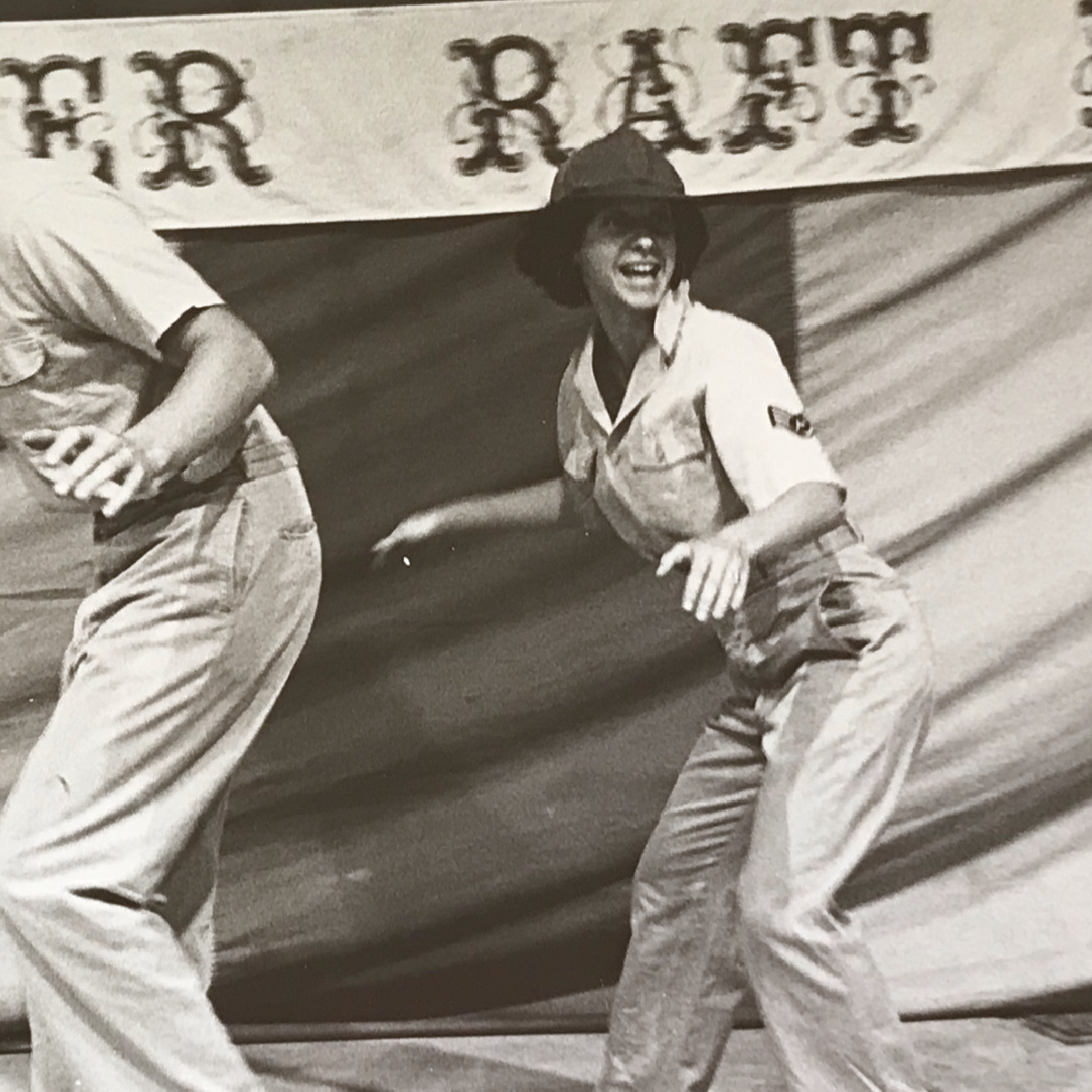
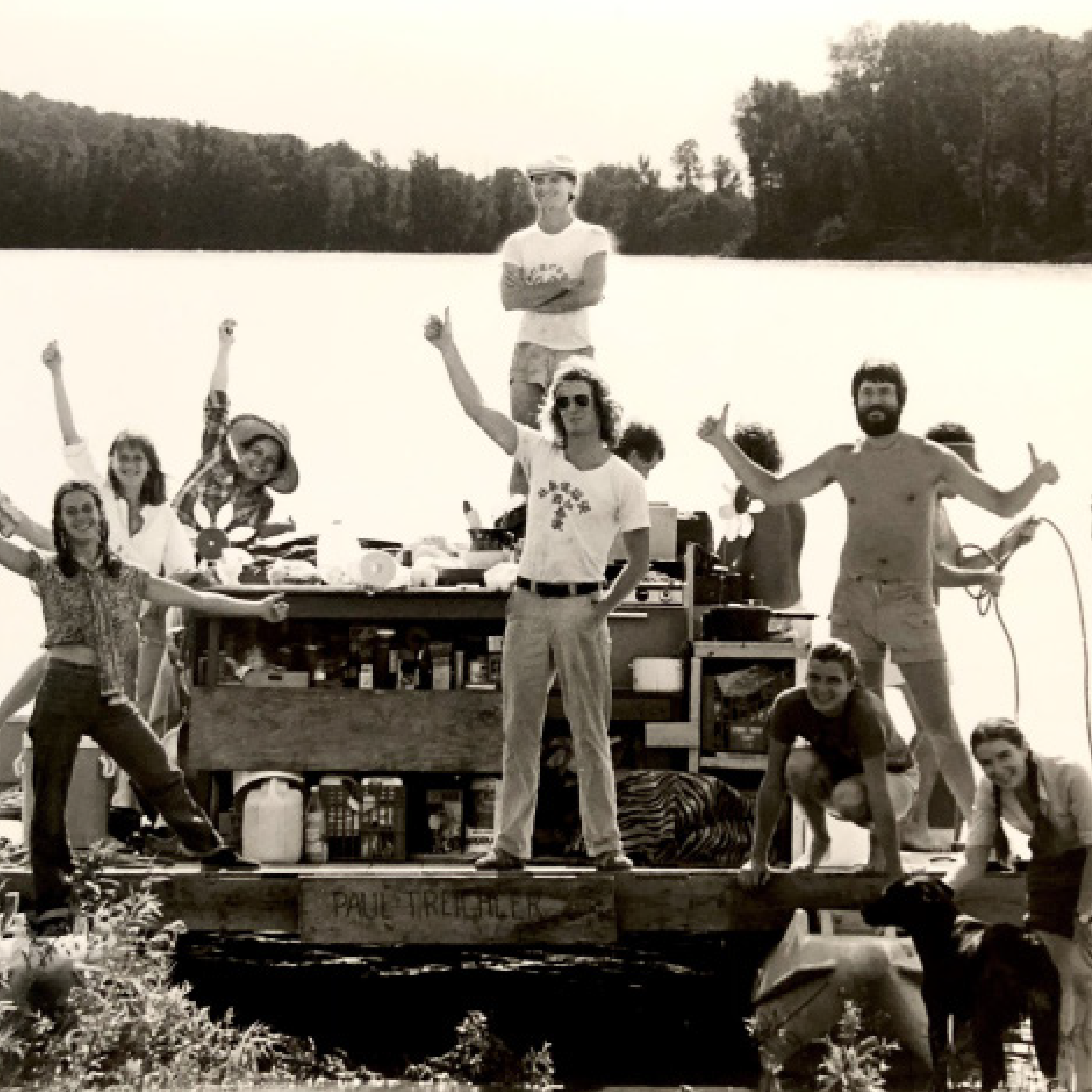
A bespoke font inspired by Sarah’s parents’ traveling theater company called Otrabanda. The group toured the Mississippi river for ten summers by raft from St. Louis to New Orleans.


Role: Creative direction and type design
Advisor: Troy Leister
Featured in: AIGA Philadelphia’s Locally Sourced
Advisor: Troy Leister
Featured in: AIGA Philadelphia’s Locally Sourced