Visually explaining palliative care
The Stratton Foundation
Health Communication Design
Thomas Jefferson University
Sarah’s role:
+ Creative direction
+ Typography
+ Illustration
+ Sketching
+ Print design
+ Poster design
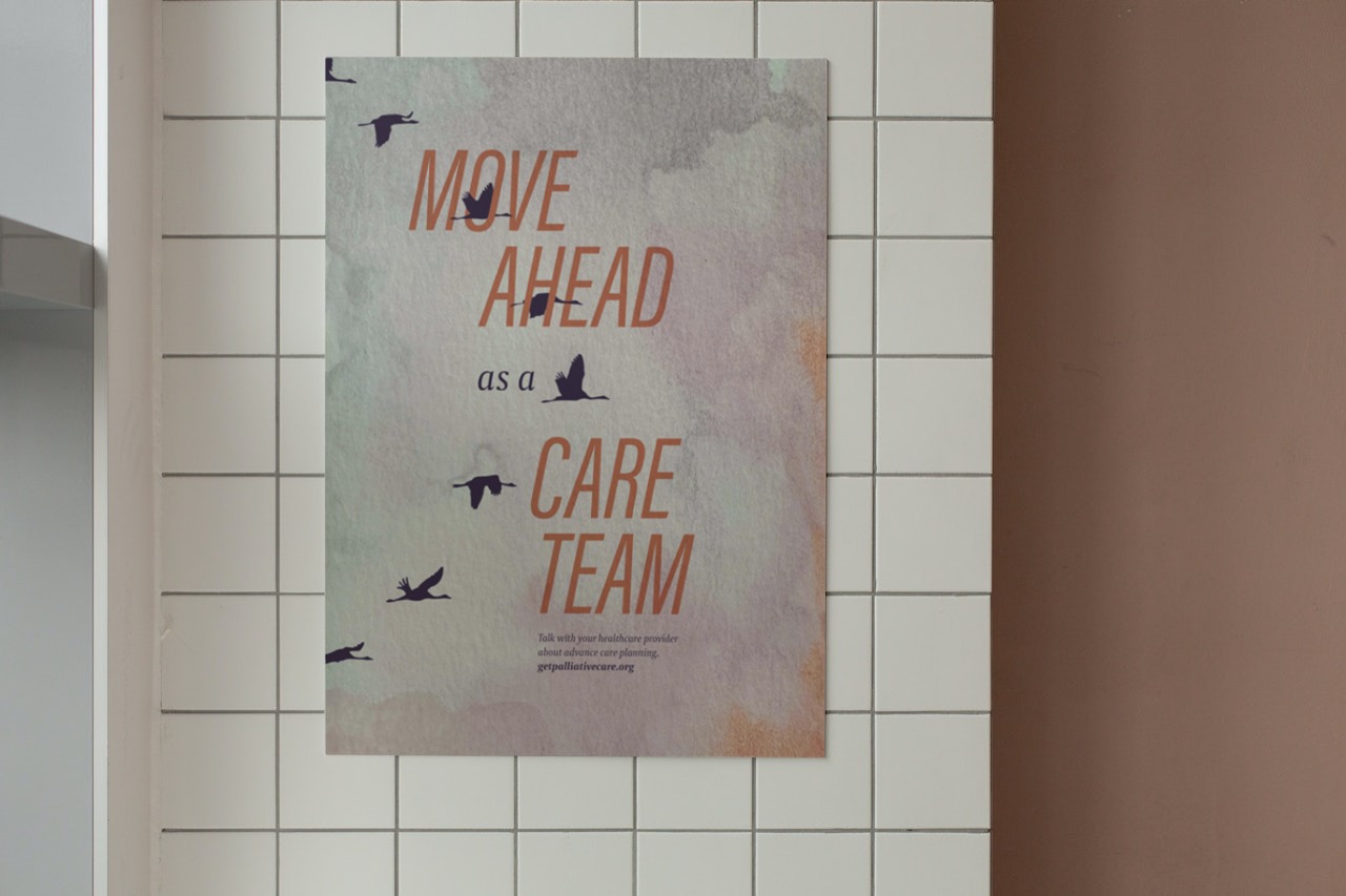
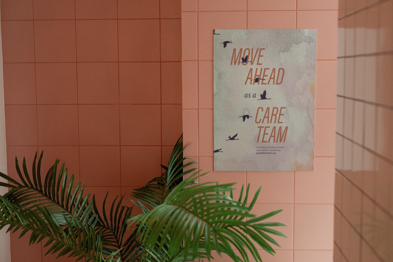
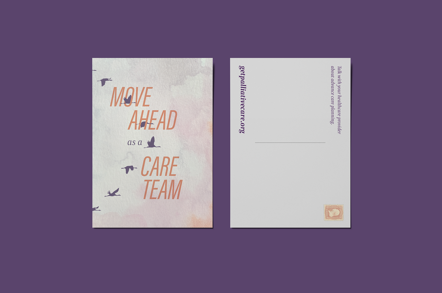
With a grant from the Stratton Foundation, Jeannette Kates piloted a telehealth program for chronic lung disease patients. Her goal was to initiate conversations about quality of life with patients well in advance of hospice and to align the actions of doctors, nurses, and caregivers. Sarah’s task was to convey this idea in a patient-facing poster.
Advisors:
Jeannette Kates, PhD, AGPCNP-BC, FPCN
Maribeth Kradel-Weitzel
Advisors:
Jeannette Kates, PhD, AGPCNP-BC, FPCN
Maribeth Kradel-Weitzel
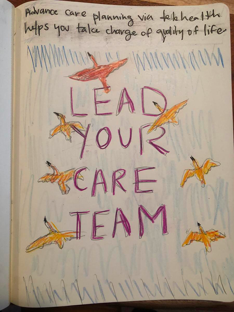
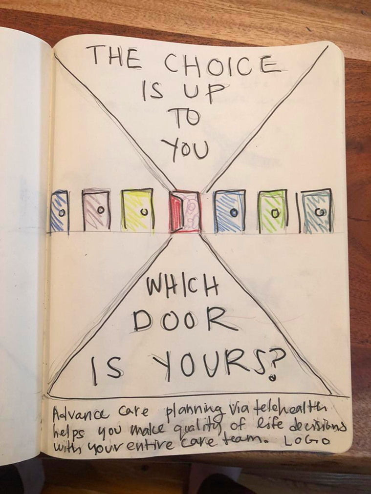
1. Sketching visual directions
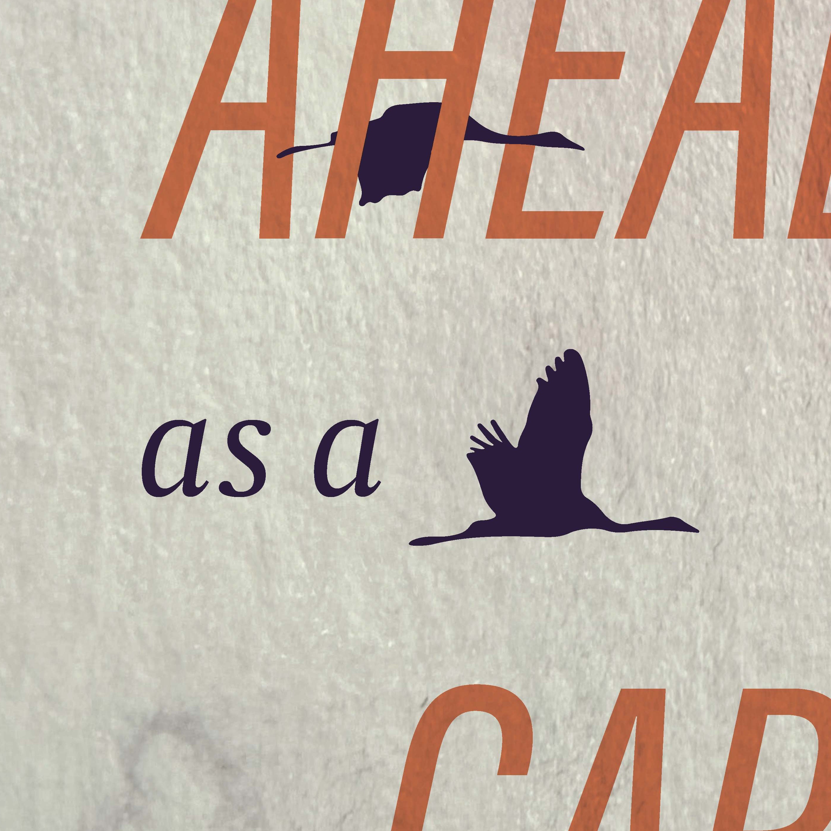
Sarah presented Jeannette with a series of sketches offering different metaphors for palliative care. The bird imagery direction was the visual winner and we workshopped the copy to match.

2. Determining the correct medium
Attempts with entirely digital texture did not hold the same emotional resonance as watercolor.
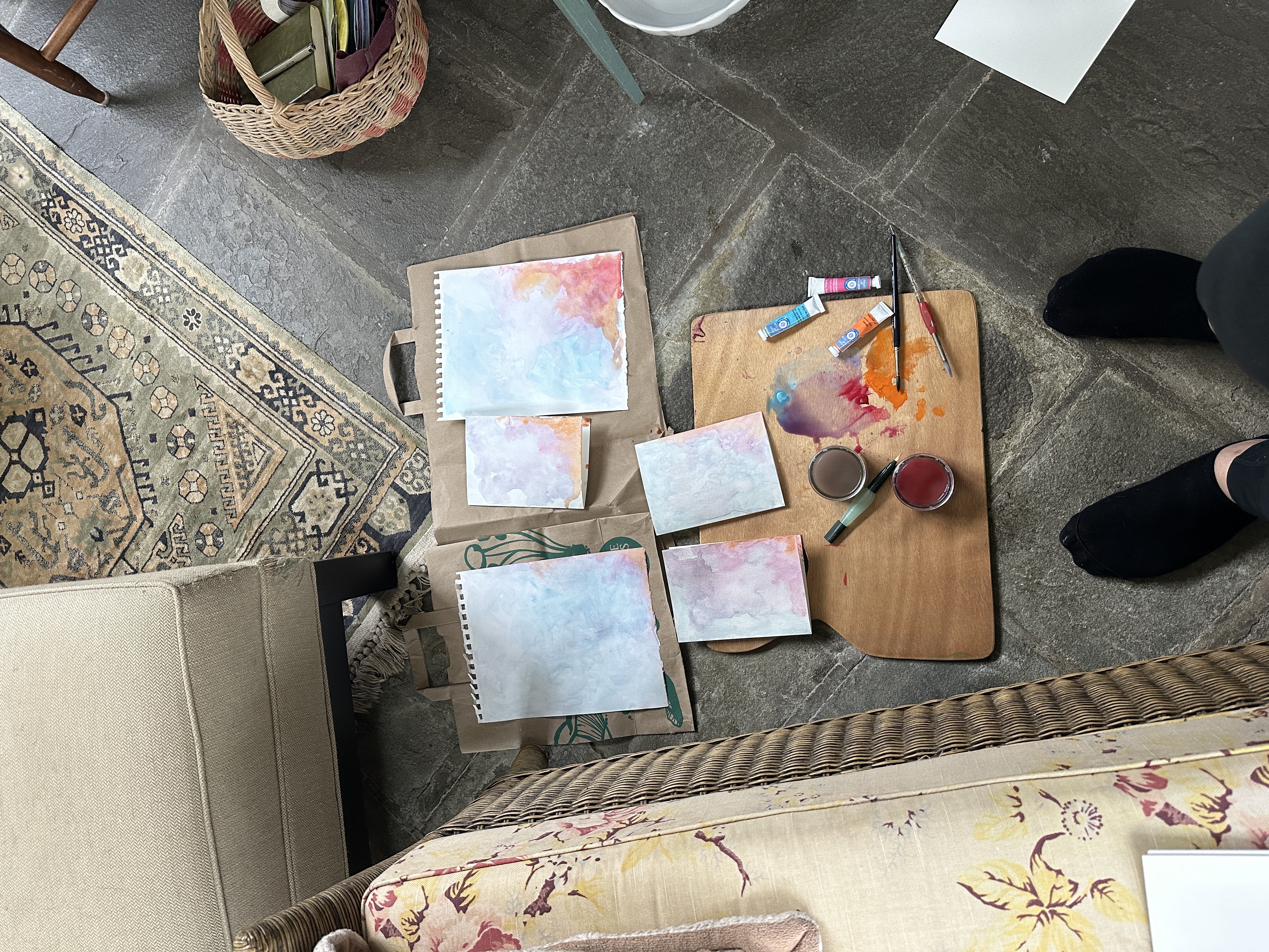

3. Integrating digital and analog
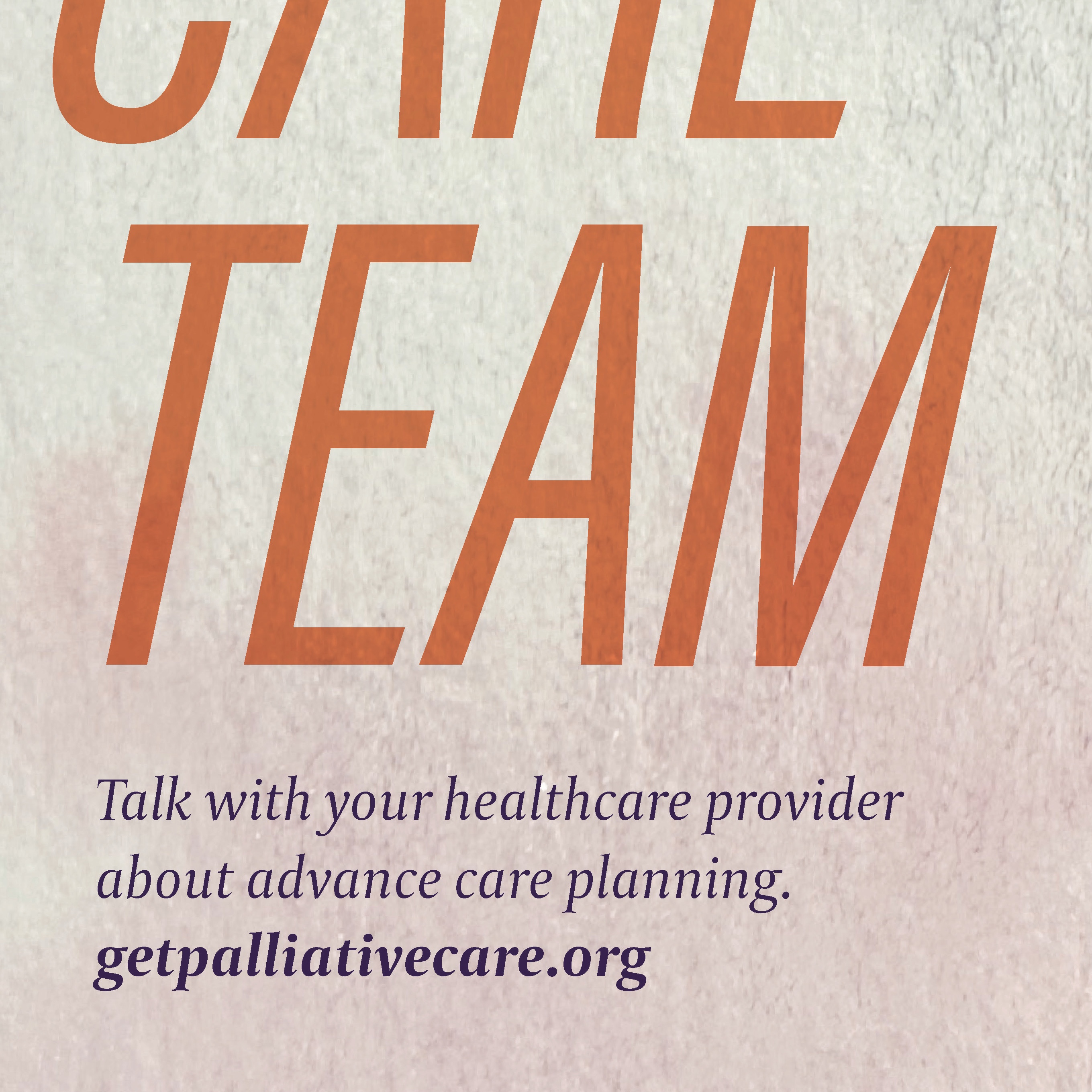
Birds flying together showed the team effort between patients and caregivers in palliative care. The italicized type indicated movement in a previously stuck process. The sunset symbolized a future that was both beautiful and transitory.