
ABOUT
SERVICES
RESOURCES
︎ Websites
︎ Infographics
︎ Social media
︎ Presentations
︎ Graphic emails
︎ Print series
︎ Type design
© 2024
Sarah Stern

︎ A visual shortcut for your explanation
Information design can make or break a viewer’s understanding of what you do, how your product works, or what your research shows. Sarah can identify the right diagram or chart for your purposes.
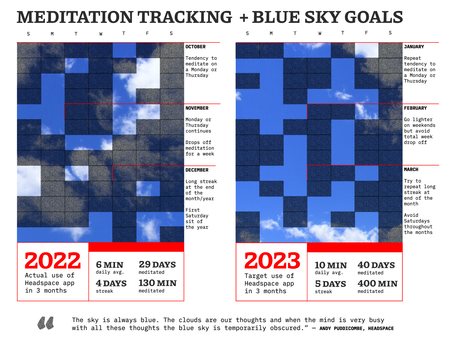
1. Quantified Self
Sarah created this visualization for Cole Nussbaumer Knaffic’s online community “storytelling with data” January 2023 challenge and it was featured with special mention on the project’s podcast.
2. Diagrams for DexCare
DexCare needed rebranded infographics for their new website that made their complex offerings understandable. Sarah used bright colors and bold shapes to draw differentiations between categories.
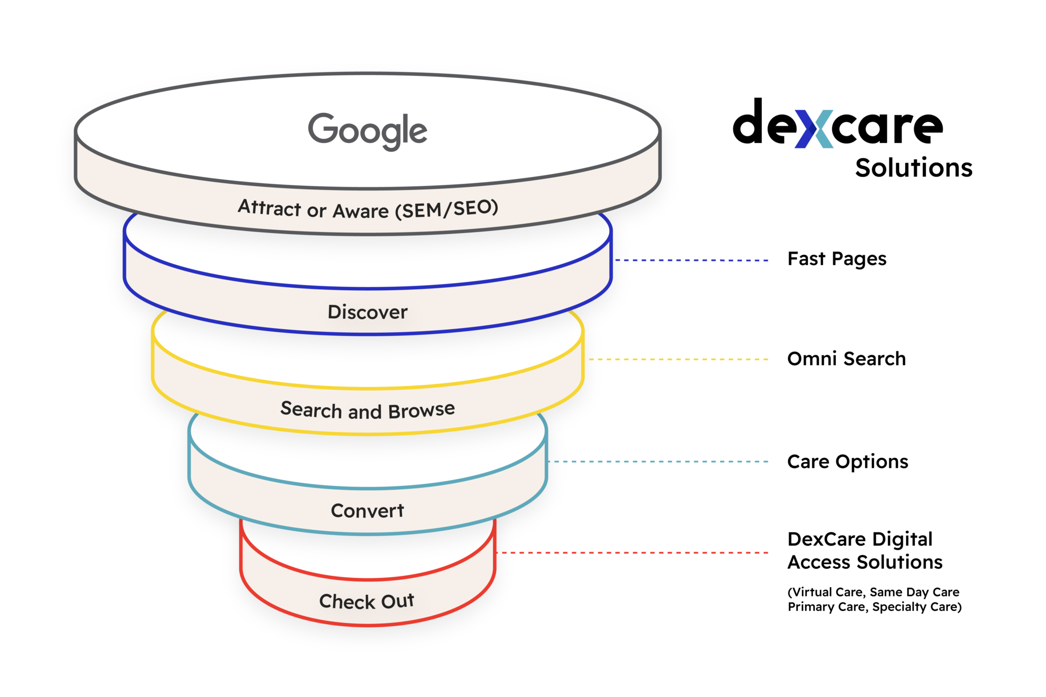
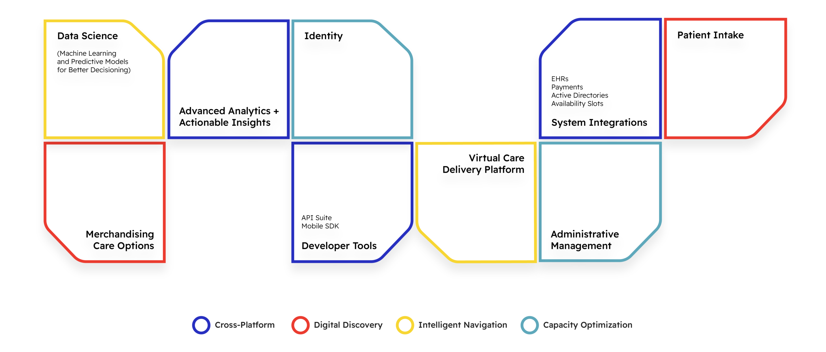
Client: Dexcare
For: Uncommon Bold
Role: Information and graphic design
Creative Direction: Joanne Lam
3. Data Portrait
In Moon Mood, Sarah offered multiple ways to read a combination of personal and lunar data shown through color and transparency around a single wheel.

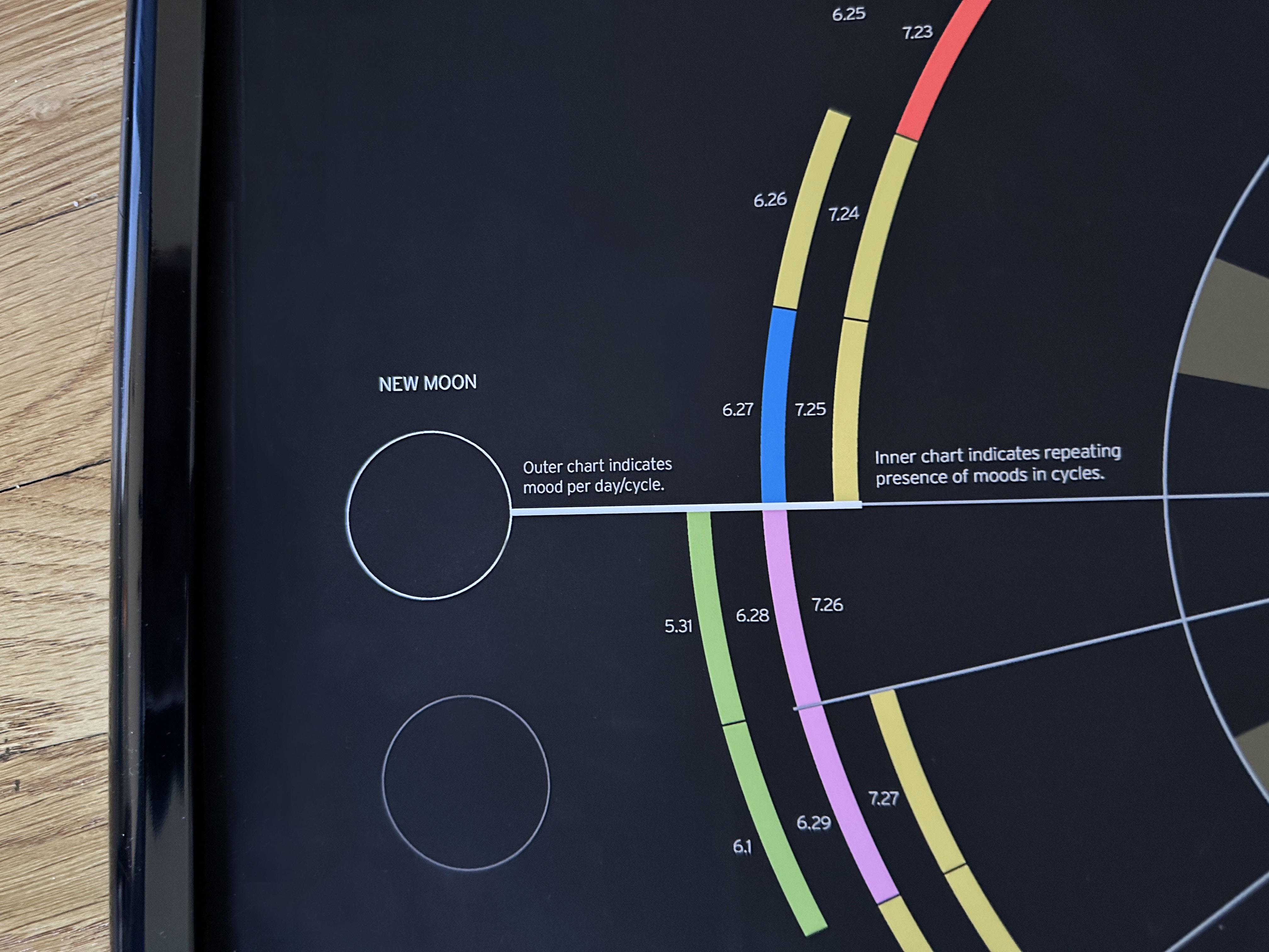
For: Communicating Health Data
Role: Information and graphic design
Advisor: Renée Walker
Featured in: AIGA Philadelphia’s Locally Sourced
Award: Longlisted for 2022 Information Is Beautiful
ABOUT
SERVICES
RESOURCES
︎ Websites
︎ Infographics
︎ Social media
︎ Presentations
︎ Graphic emails
︎ Print series
︎ Type design
©2024
Sarah Stern